
Unsolicited Redesign
Seattle Children’s Theatre Structure Redesign For Accessibility
Scroll ↓
Roles
UX Designer, Idea Generation, UX research, Information Architecture, Wireframing, Prototyping, Brand Application
Tools
Figma Miro, Pen and Paper, Adobe Suite, Mainly Illustrator
Project Length
1.5 Months, October 2022- December 2022
Overview
Seattle Children's Theatre aims to provide children of all ages access to professional theatre, with a focus on new works, and theatre education. They believe that young people deserve to engage in stories with meaningful themes of hope, compassion, resilience, friendship, courage, and above all - joy. Children are enriched by opportunities to use their imaginations and ask their own questions, embraced by a creative, responsive community.
The challenge is to understand Seattle Children’s Theatre users' response to the current website, discover pain points and propose a solution to improve their experiences.
The core of Seattle Children's Theatre’s mission is accessibility, yet their website design doesn't reflect this. The user experience is unintuitive and in need of a refresh. This project was initiated to rectify that and to redesign the company’s website to enhance the overall experience and flow of the site. It was important to focus on making the website more accessible, increase meaningful traffic and completed journeys.
Researching and Defining the Problem
According to the Nielsen Norman Group, there are several valid reasons to consider a website redesign, including an outdated appearance, inefficient information architecture and broken links, a confusing user experience with a lack of cohesion, and poor user engagement as indicated by analytics. All of these factors can significantly impact the effectiveness and success of a website, making a redesign necessary.
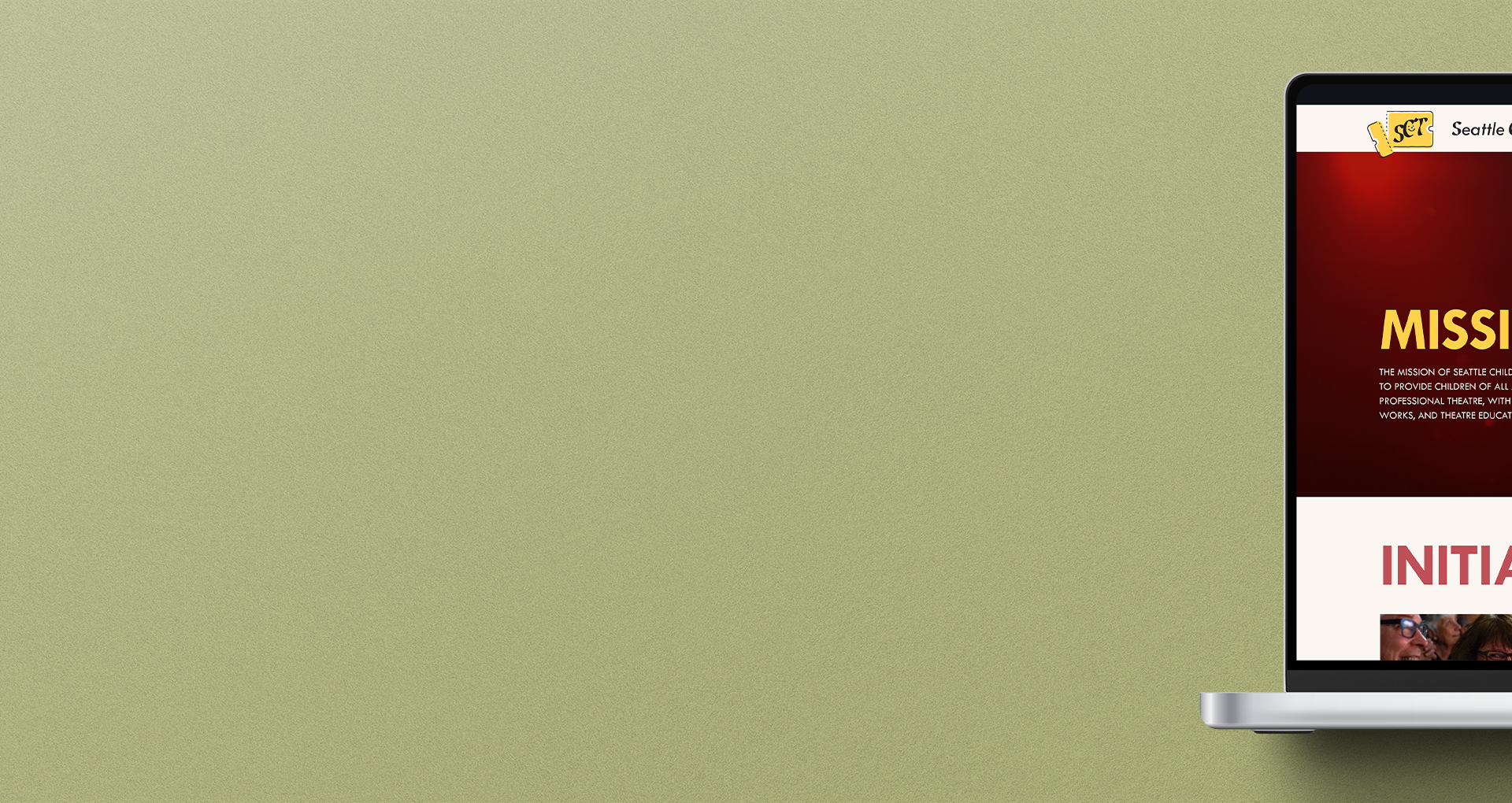
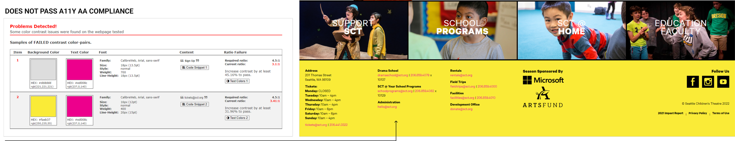
I had a theory since my first experience of the website; I suspected the high contrast of the colors and visuals on the SCT website were causing eye strain, and that fact combined with poor general design aesthetics on the illustrations ( while subjective, can still be relevant) are likely contributing to the low amount of time users spend on the site and hindering completed user journeys. To ensure I wasn't making design decisions from a place of bias I decided to first validate one of this theory about the impact of aesthetics on user experience. I first conducted accessibility checks and found that the colors used for hyperlinks and other sub-text do not meet the color contrast requirements for AA compliance.
Additionally, bright and highly saturated yellows, like the ones used on the website, are dynamic and stimulate the eyes, using these colors on large elements or backgrounds can lead to eye strain, also hindering the overall user experience. Although our brains generally try to adjust our perception of all colors so we can see them at close to the same brightness, we don’t really. Even in full sunlight, we perceive yellow and green colors to be brighter than orange or blue, and vastly brighter than red or violet. The graph above explains these effects well.
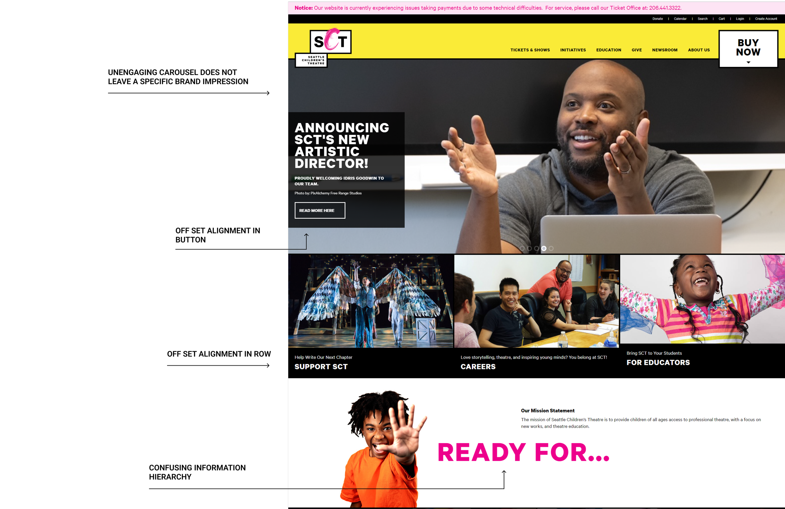
Continuing on with the theory with basis from the aesthetic usability effect, The first page of a website is critical in creating a positive first impression and engaging users. Here are some of the other issues I found:
In order to design solutions without bias, it's important to have a clear understanding of the users. To achieve this, I conducted research to identify the audience for Seattle Children's Theatre. The analytics were pulled from the SCT website.

To see if Seattle Children’s Theatre website fell under this umbrella, I conducted a Heuristic Evaluation and researched the website's performance using online tools like Similarweb.com. This revealed a high bounce rate of 49.70%, which means that many visitors are leaving the site after only visiting one page. (Data from Semrush suggests the average bounce rate ranges from 41% to 55%, with a range of 26% to 40% being optimal, and anything above 46% is considered “high.”) This indicates that the landing experience is not meeting the expectations of the visitors. The high bounce rate could be due to one of three reasons: 1) the website is confusing and visitors don't know what to do next, 2) the on-page content doesn't address the visitors' needs, or 3) the site's aesthetics are poor (Aesthetic-Usability Effect).
User Demographic Research
Market Analysis
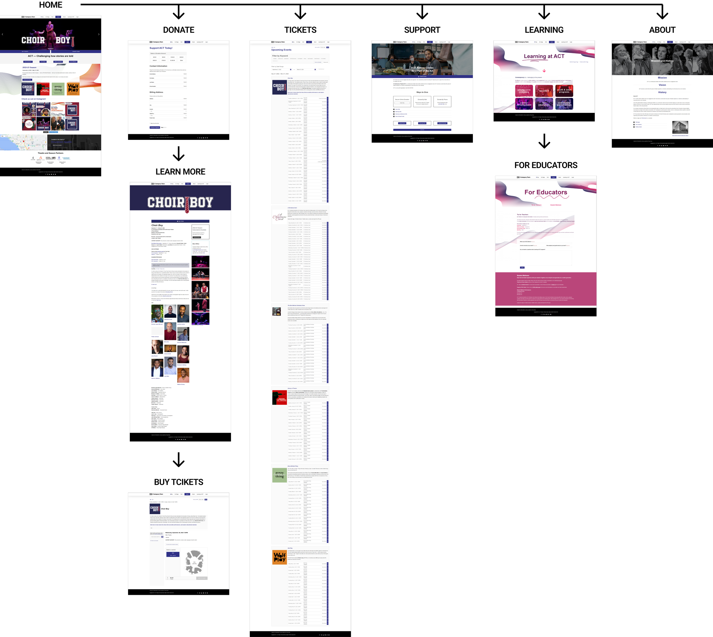
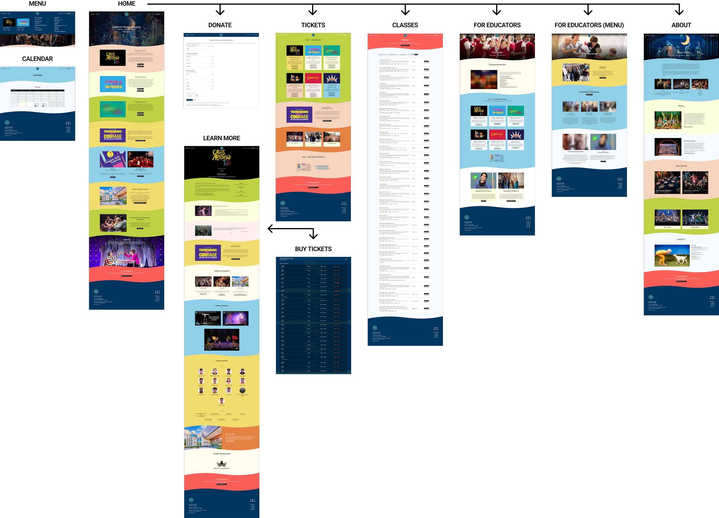
I understood how Seattle Children’s Theatre stands on its own both in structure and audience, but nothing exists in a vacuum, I need to understand how it operates in the whole of its market, and to do this I need to look at other players. So in order to gain insights into the children's theatre market and its best practices, I conducted research on other players in the field, both in the same region and nationally recognized leaders. The focus was on Young Performers Theatre, Children's Theatre Company, and a Contemporary Theatre. My findings were documented in a Competitor Capability Summary. To evaluate the standard of design and organization, I created low-level site maps on each of the competitor's websites. To deepen my understanding, I also reviewed articles, statistics, and other relevant information related to the domain. The goal was to analyze the strategies and approaches used by the competitors. The competitive market analysis of the children's theatre websites reveals the following:
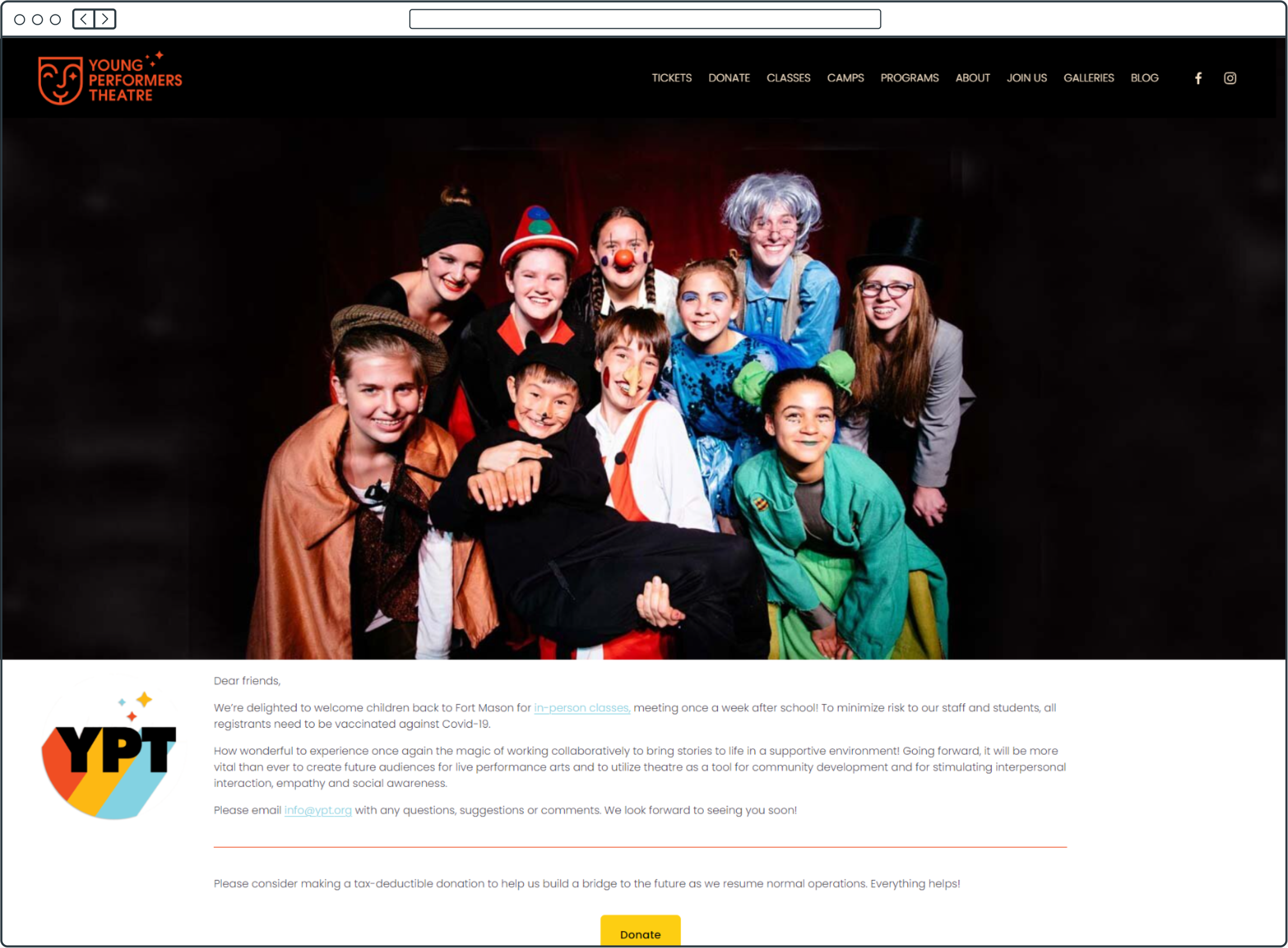
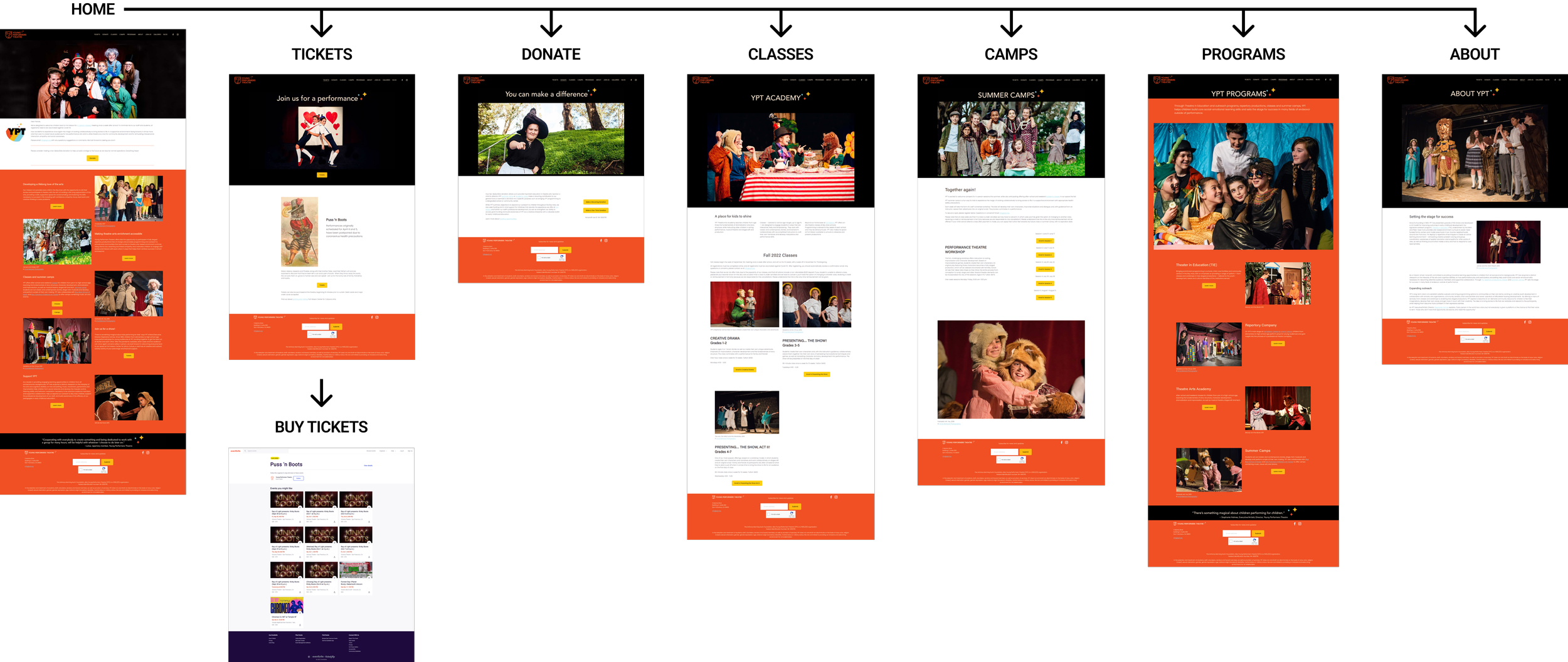
Young Preformer’s Theatre
A Contemporary Theatre
Children’s Theatre Company
Young Performers Theatre (YPT) has a sleek and modern aesthetic, with a well-designed logo and brand colors that set it apart. However, it needs to place more emphasis on its copy, calls to action, and information architecture. The mental model of users visiting the website is straightforward: to find information about shows and purchase tickets. The website layout is minimalistic and has fewer pages, but lacks a clear hierarchy and direction for the user.
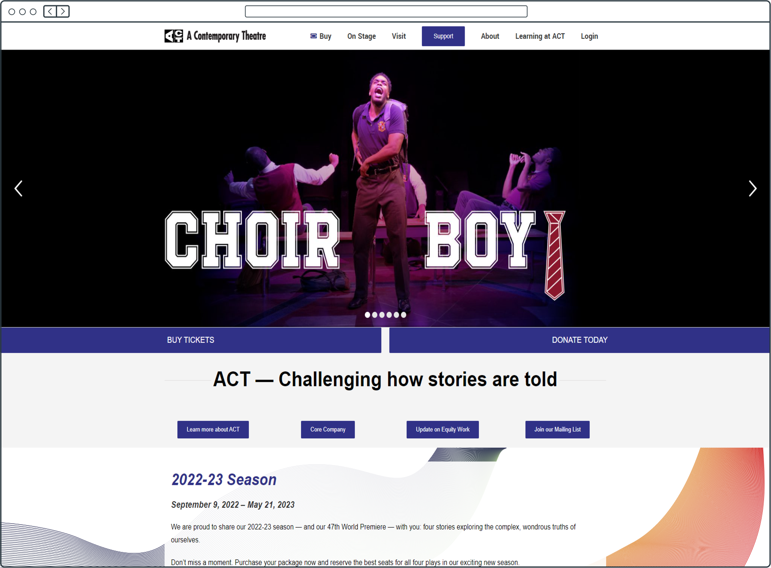
A Contemporary Theatre (ACT) also has a minimalistic design with a simple layout. However, the website fails to provide a clear hierarchy of information and lacks contrast in buttons to guide the user's attention. The mainstage performance is prominently displayed on the homepage, allowing users to quickly access relevant information. Despite this, the website uses a carousel, similar to SCT, which can be overlooked by users and negatively impact their perception of the organization.
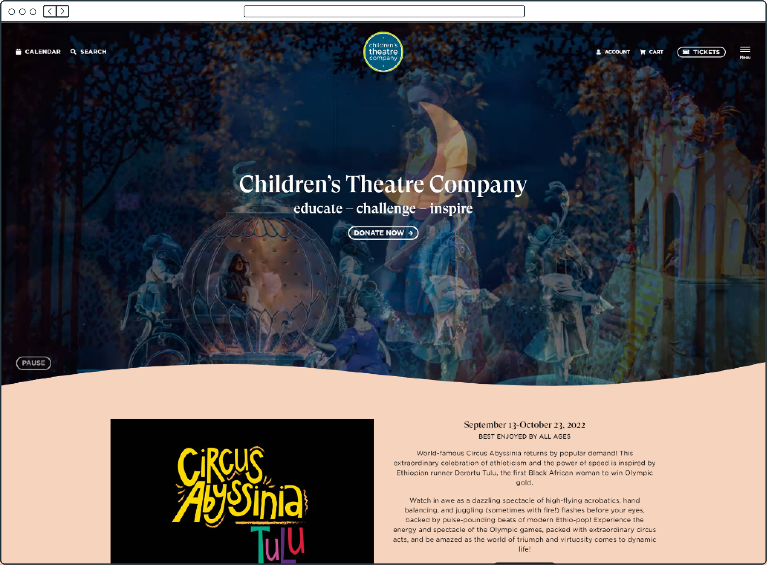
The Children's Theatre Company has a sleek, organic design that emphasizes its values and prominently features its donation button, ticket buying options, and a preview of the current season's performances. The landing page also has an automated carousel, but it showcases images that provide a glimpse into the theatre's environment, rather than news updates. The website is easy to navigate and well-structured, making it a strong competitor in the market.
Seattle Children’s Theatre
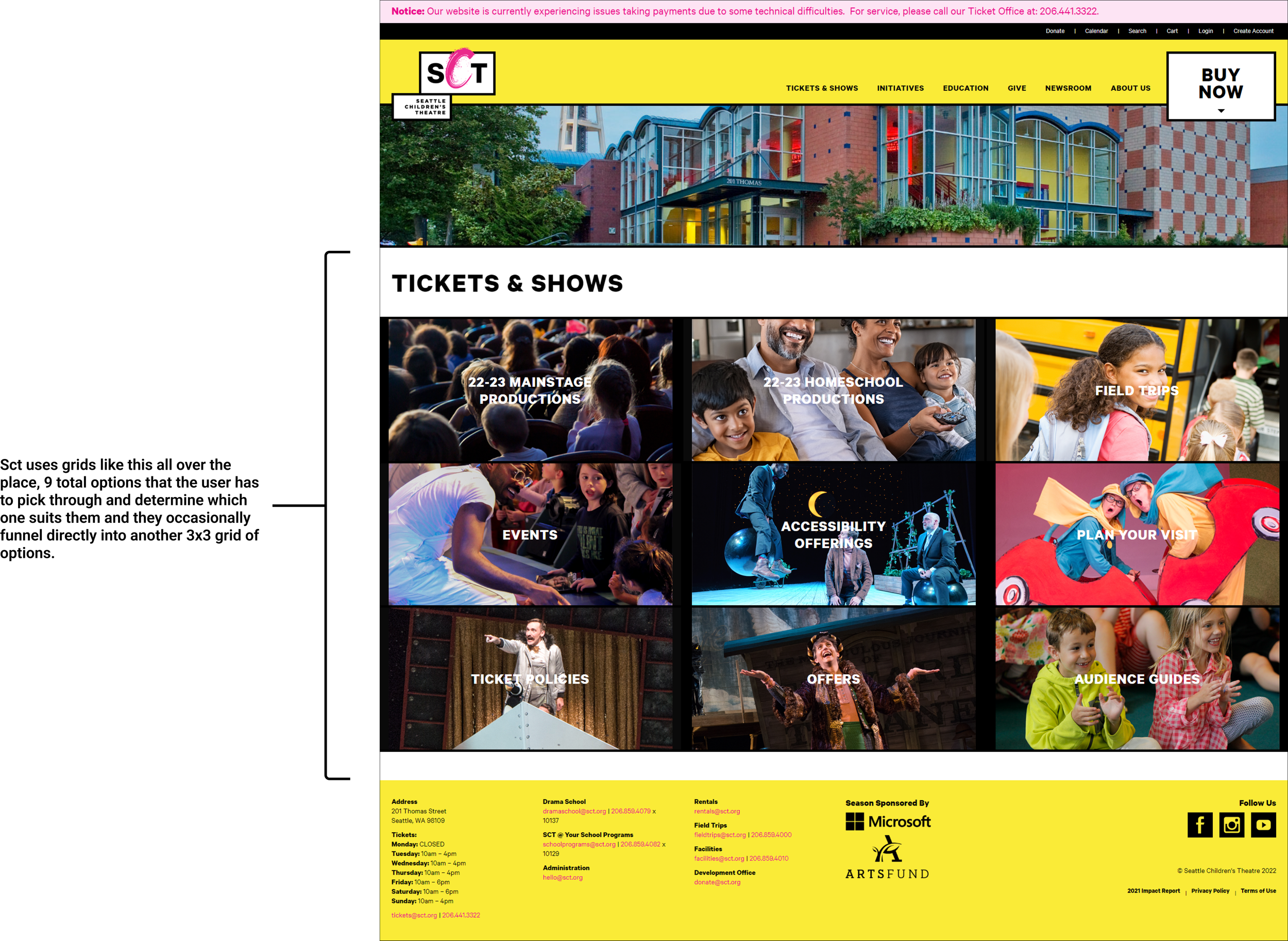
Compared to its competitors, Seattle Children's Theatre (SCT) has a more complex path to reach the desired information and buying process. The current design requires users to navigate through additional pages, which increases the time and effort it takes to reach their goal. The button grid structure presents multiple options, ranging from 9 to 18 options that the user must access before getting to the end, making it harder for users to quickly make a decision and potentially causing "analysis paralysis". The design does not effectively streamline the user's journey towards the end goal of purchasing a ticket for themselves or their students Hick’s Law continues to rear its head when taking a deep dive into the issues of the SCT website as it stands.
Lack of A11y Compliance
Aesthetic Usability Effect


Hicks Law and Streamlined User Flow

The high bounce rate on its own may not give a complete picture of website performance, as there are other metrics that need to be considered, such as pages per session. On average, users visit 3.96 pages per session, which is noteworthy considering that to complete the user journey, whether it be booking a class or buying tickets as a parent or teacher, it typically requires navigating through about 5 pages. The current website structure requires users to navigate through multiple pages to find the information they need, and as the number of options increases, the effort required to gather information becomes more significant. This can lead to a phenomenon known as "featuritis," (HICKS LAW) which can overwhelm users and hinder their ability to make informed decisions. Remediating this structural issue is crucial as it would contribute to a seamless and streamlined user experience, leading to higher levels of satisfaction and likelihood of repeat visits.
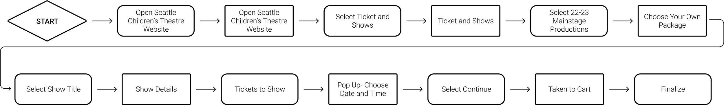
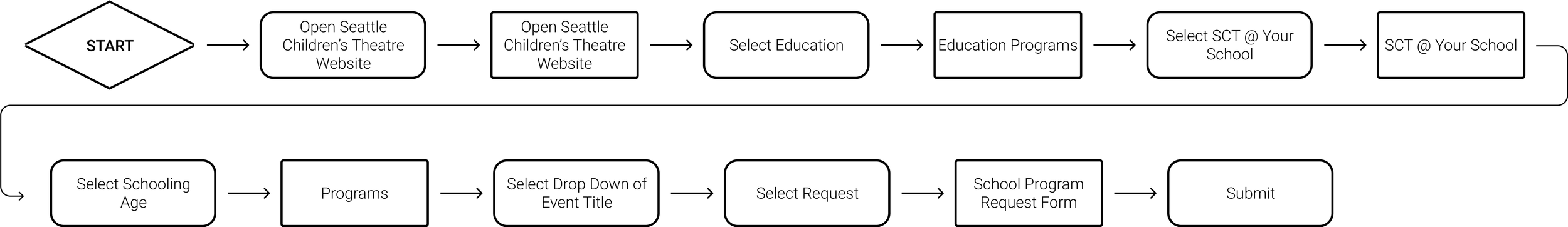
Ticket Buying Flow
Education Program Flow
Research
Key Insights
Even distribution between gender demographics
Largest user demographic being users 25-34 years old.
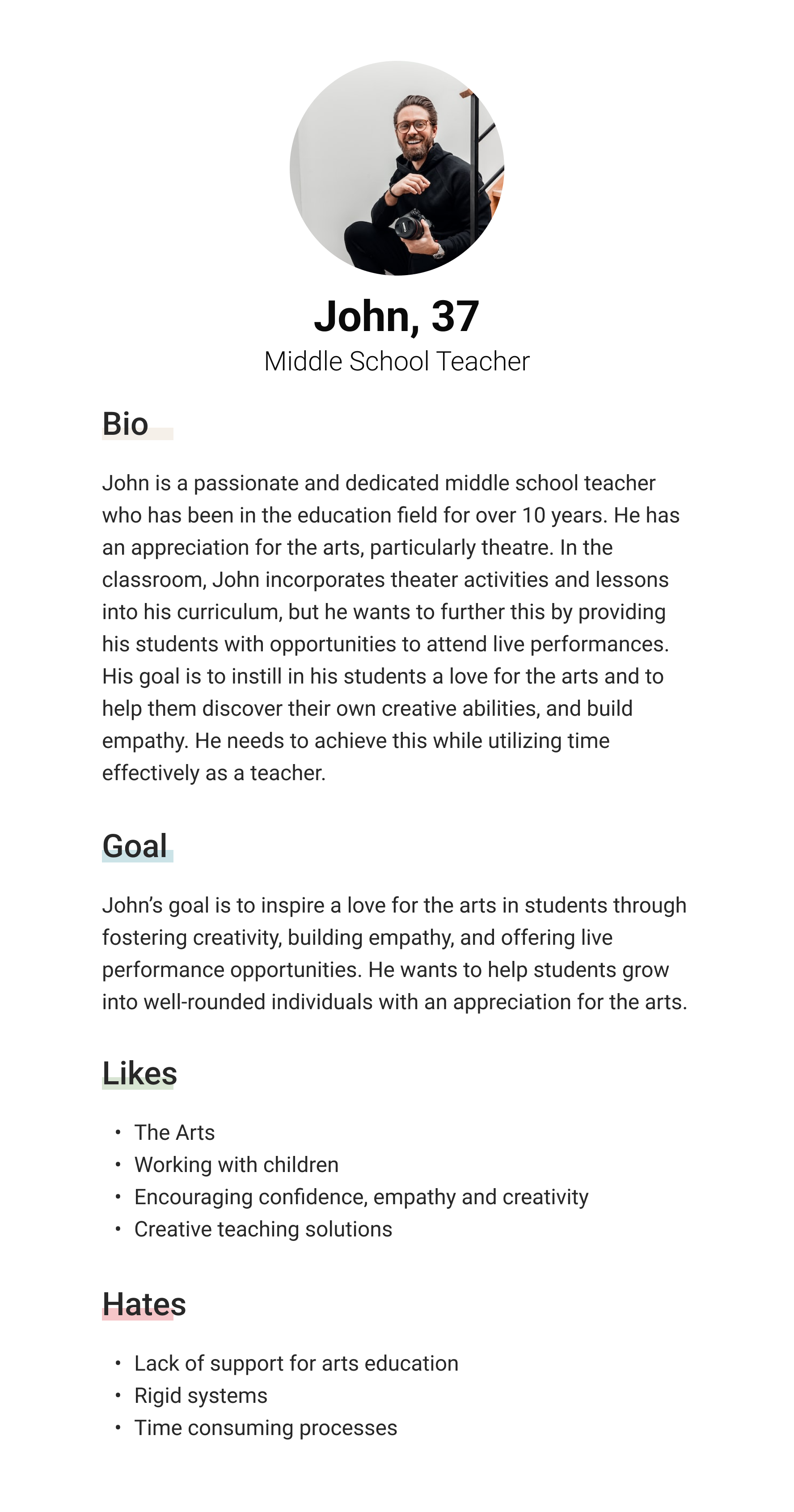
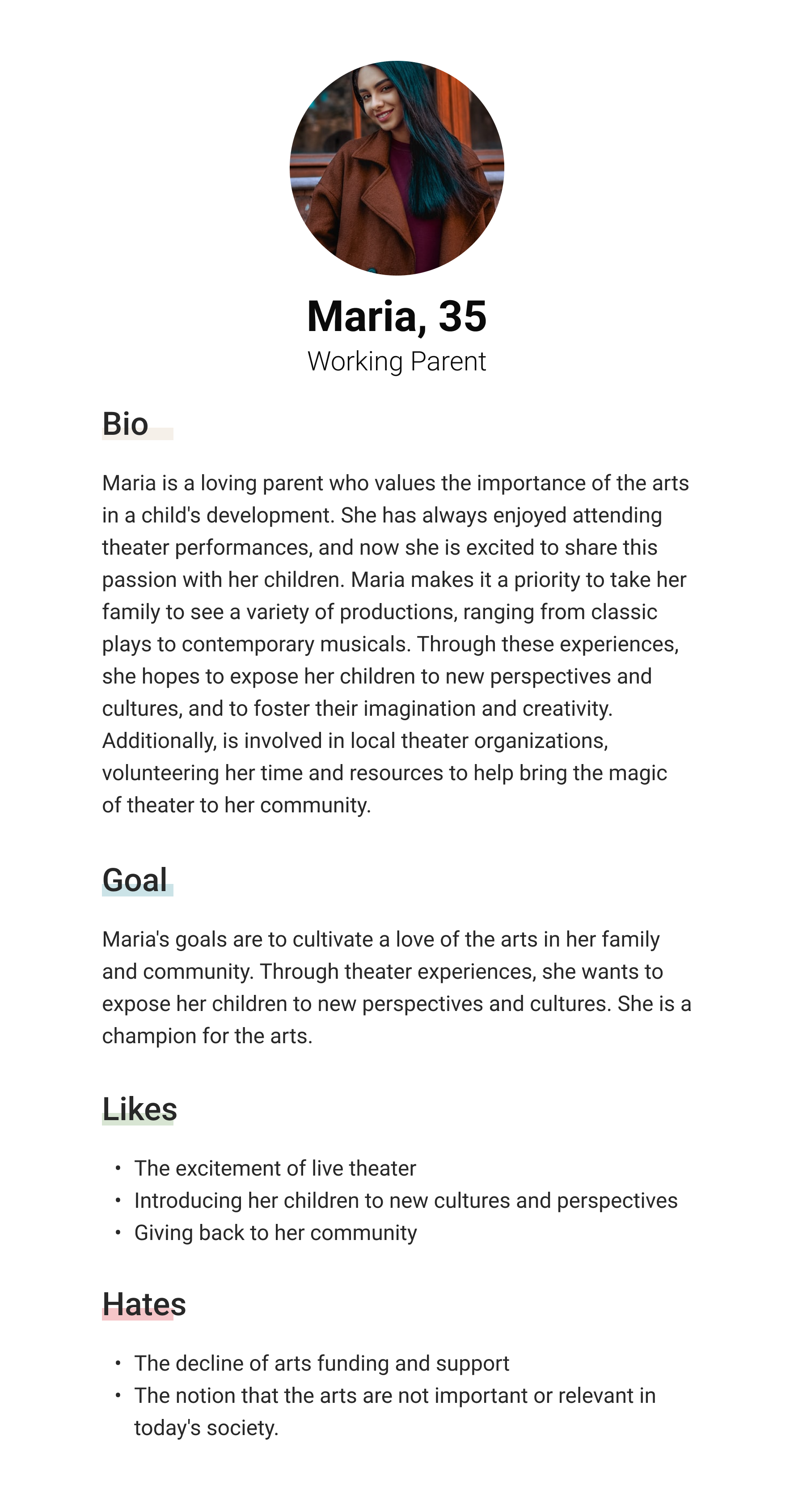
The primary audience consists of Washington parents or teachers seeking to expose their children or students (aged 3-15) to the benefits and culture of theatre.
To ensure that my design decisions are grounded in empathy, I created two personas based on these findings. These personas will serve as a touchstone for my design principles, helping me to design with the users' needs, goals, and behaviors in mind.

Design Process
To create a better user experience I am going to restructure the website with our main users goals in mind, simplifying and streamlining options to reduce analysis paralysis. Having too many elements on the homepage can obscure necessary information, while having too few elements can result in a lack of utility and usability. I am also aiming to enhance aesthetics while maintaining brand integrity. This is crucial as aesthetics play a significant role in a user's perception of a website. I am thinking about the phrase "Create Focus, Simplify, Organize, and Enhance" as I approach solving these issues in the design phase.
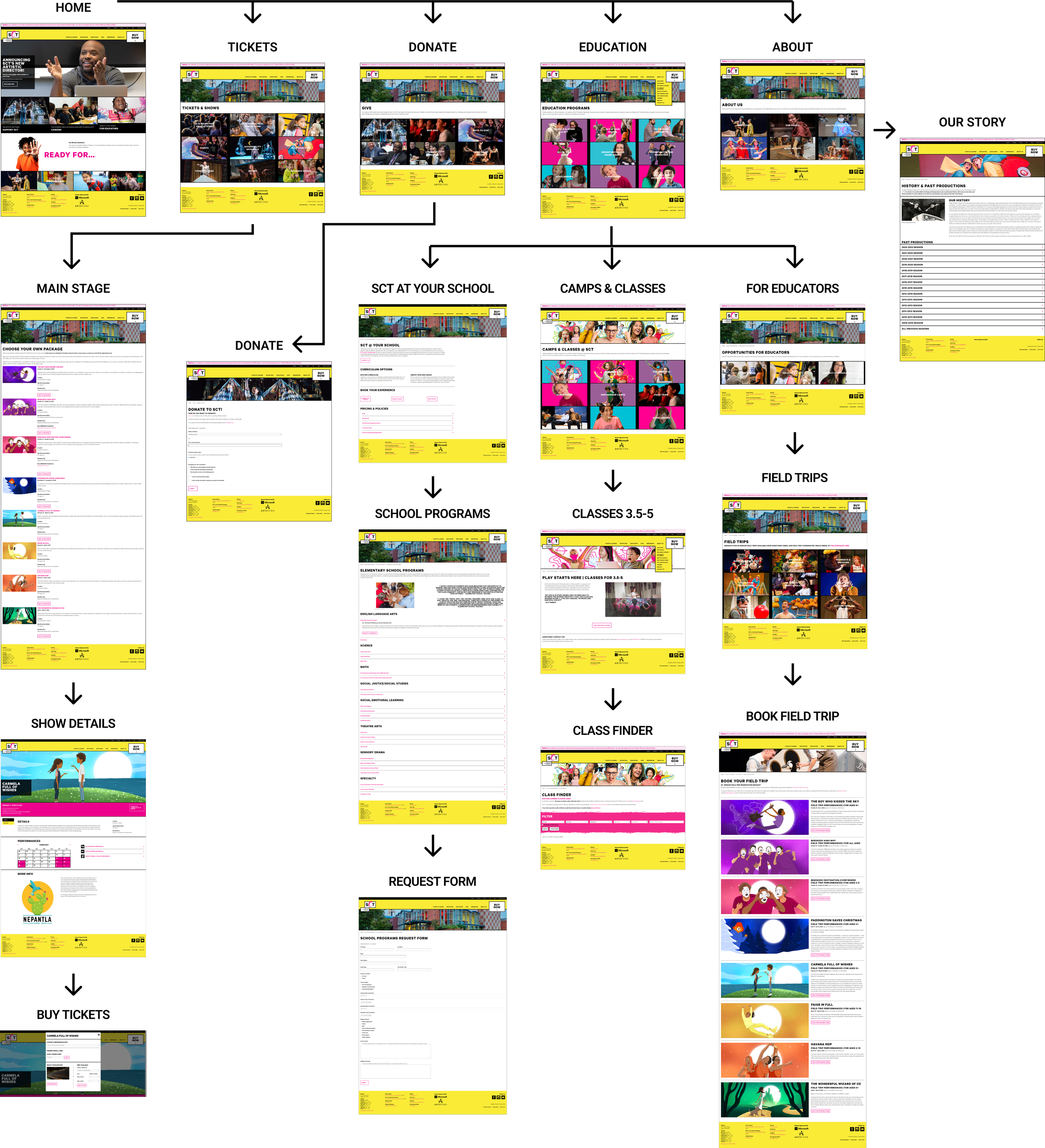
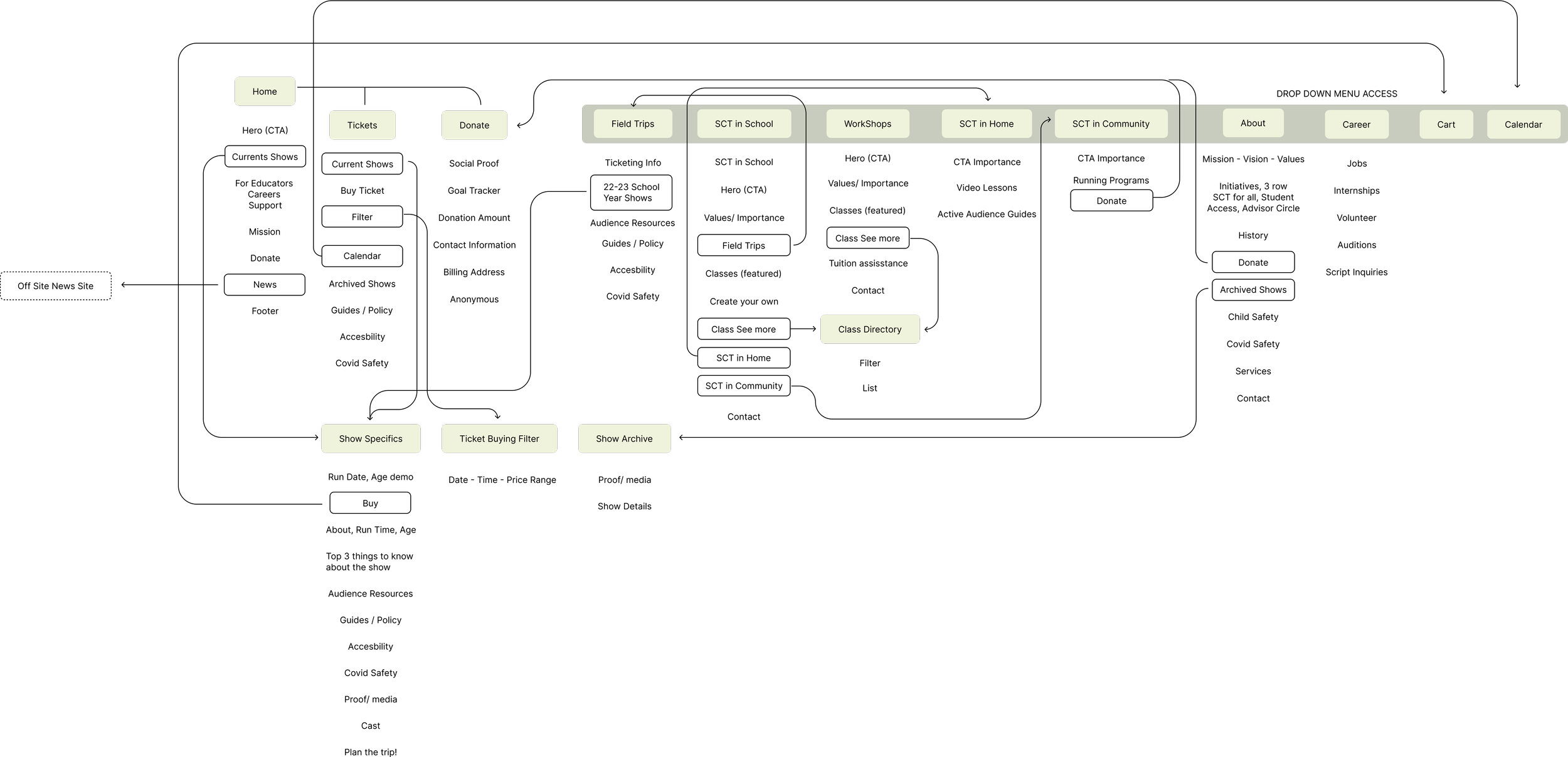
To streamline the website's content, I reorganized it into categories, making it easier for our two personas to achieve their goals. Initially, my bias led me to believe that the number of pages on the website was excessive, but upon closer examination, I realized that the site offered a wide range of services that needed to be segmented out for better organization and navigation. As I created an updated information architecture map, I made an effort to condense and simplify wherever possible, while still ensuring that the website was structured around the goals of our personas. This approach allowed me to strike a balance between offering comprehensive information and making the site user-friendly and accessible
Structure
Wireframe Sketching


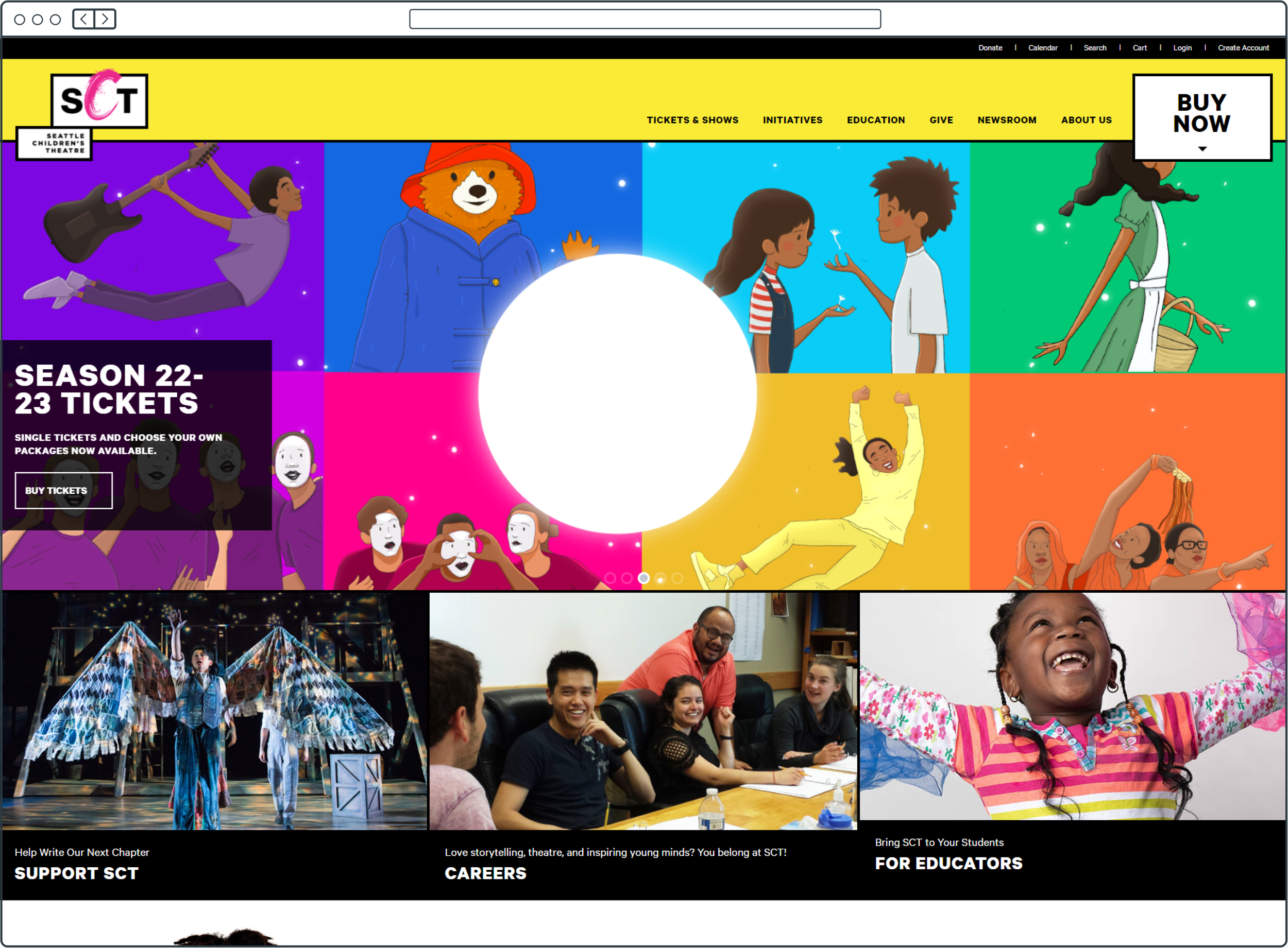
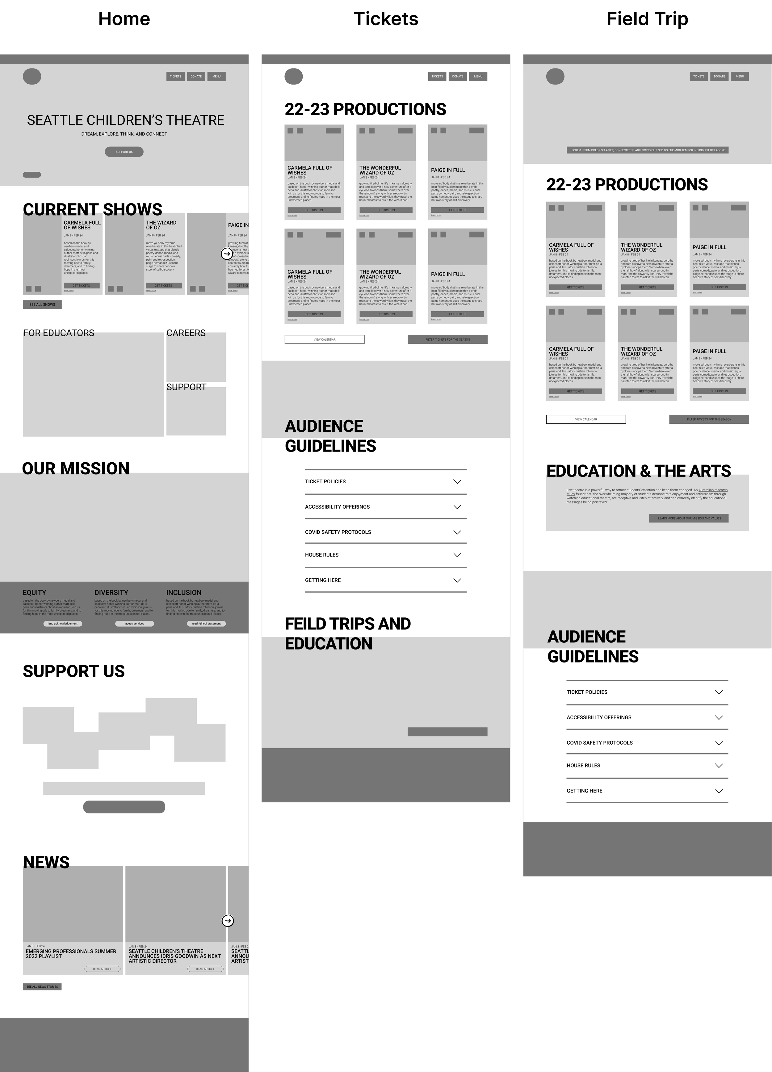
For my first sketched wireframe, I zeroed in on the home page as the centerpiece of the website. The home page should feature the current season's productions, a synopsis of each show with ticket purchasing options, information about the educational and partnership programs, the mission statement, and the latest news updates.
To make the landing page even more impactful, I eliminated the carousel and introduced a hero image or video section. I also repositioned the news section to the bottom of the page, ensuring that the first impression for users was focused on the main offerings of the site. The season's productions and their accompanying information were placed prominently "above the fold" to grab users' attention.
Once I was satisfied with the low-fidelity wireframe, I moved it over to Figma to create a digital version. I repeated this process for the majority of the wireframes, first sketching them out on paper and then refining them digitally. By pushing myself to consider multiple options and experiment, the final result was always stronger than my initial ideas.
As I moved forward I came up with a layout grid to help keep the design organized and consistent, improving the user experience. This improves the overall user experience by making it easier for the user to understand and navigate the website, and a foundation for responsive design, making it easier to adapt the website to different screen sizes later on. I used this layout grid to position my elements as I continued the process of elaborating on these low fidelity designs and implementing placeholder copy text.
Mid-Fidelity Prototype


Mid-Fidelity Wireframe Process
Design Solutions
As I prepared to bring these frames to high fidelity, I made the decision to prioritized the design and development of the home, about, and production pages. Throughout this process, I carefully crafted and implemented reusable components, incorporating playful and engaging micro-animations. My primary focus was to create a responsive design that was not only accessible, but also engaging and enjoyable for users. I consistently kept this in mind as I progressed, ensuring that the end result was a truly immersive and memorable experience for users. I incorporated a lot of playful elements, leaning into the childlike nature of not only the heart behind SCT but the purpose as well, to serve both children and parents/educators.
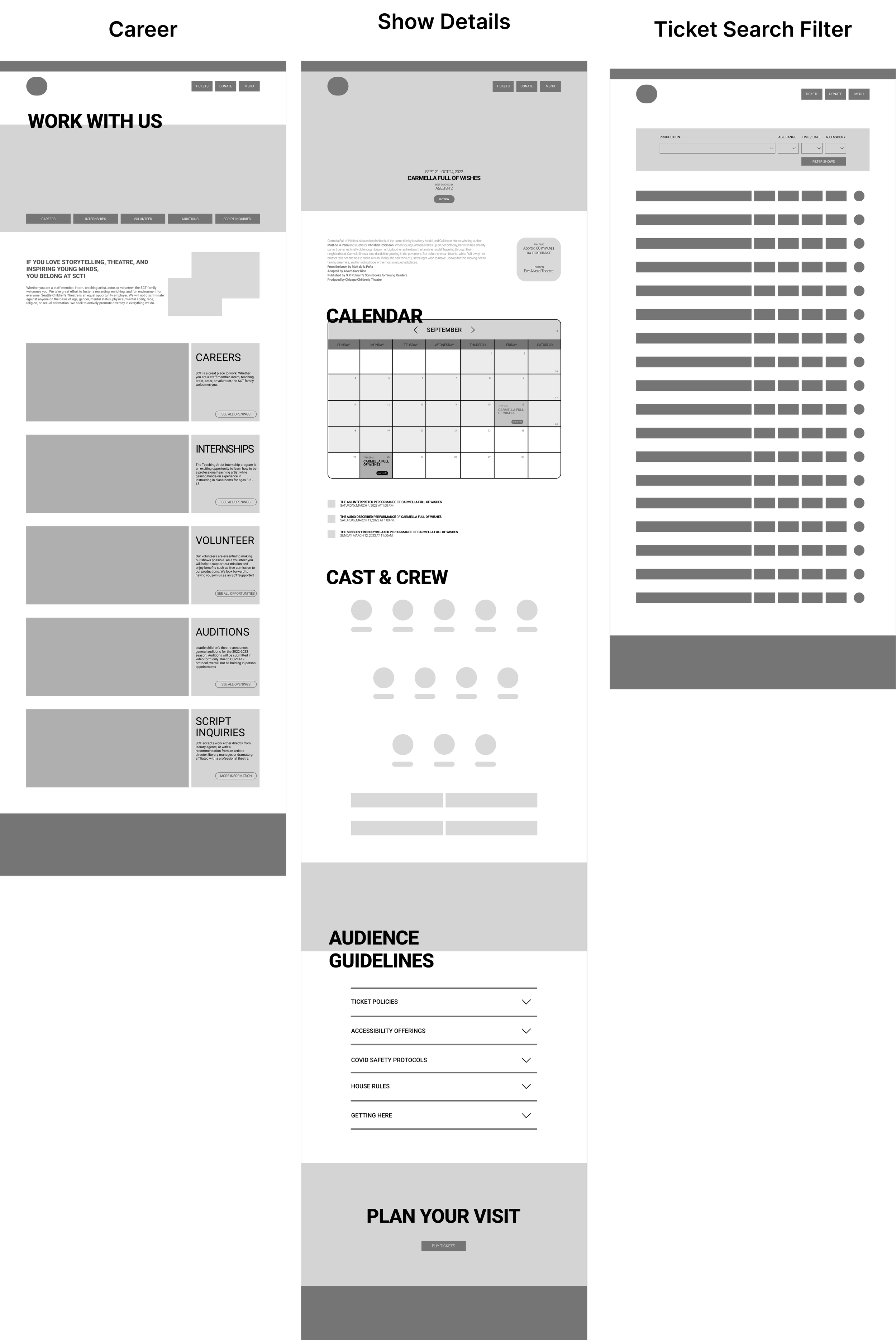
Solution & High Fidelity Screens
Home
Seasonal Productions
About
Key Reflections
During the redesign process, I discovered that my focus on accessibility may have resulted in some text being excessively large. In the future, I aim to find a balance between design appeal, usability, and accessibility. While I believe I have made significant improvements in making the website more visually appealing and accessible by this logic, there is always room for further refinement. I will continue to strive for the optimal balance between these important considerations, to create the best possible user experience.
Moving forward, it would be valuable to conduct A/B testing to assess the impact of the redesign on website bounce rates and engagement. By comparing the results of the new design to those of the previous design, we can gain a deeper understanding of what works well and what could be improved and further iterate.
Brand Refresh
Before I moved forward with refining these designs into high fidelity, I wanted to take a look on what adjustments that could be made to SCT branding to increase recognizability and, in terms of palette ease of use. chose to focus on refining the company's existing yellow and pink color scheme. While staying true to the playful spirit of the brand, I adjusted the colors to create a more visually appealing and mature palette that is easier on the user's eye. The offset styling, which features bright and vibrant hues, emphasizes the whimsical and imaginative aspect of coloring outside the lines. The updated branding reflects the unique and playful nature of the brand, while also appealing to a wider audience
Note: In this unsolicited redesign project, I have the opportunity to take creative liberties and revamp the branding more intensively. Unlike a client project, there were no constraints or limitations on the direction I wanted to take the design, so for this part of the project I was able to ideate and flex some of my design preferences. I was able to experiment with new ideas and push the boundaries to create a unique and impactful brand identity. Which is what I aimed to do here.

Interactions and Animated Elements Moving Forward
Try Out Micro Interactions Here

High Fidelity Screen Pages
The goal of redesigning the children's theater website was to make it more accessible and modern. The focus was on creating a user-friendly experience for our two main users, teachers and parents, and allow them to easily and intuitively reach their goals. The process involved restructuring the website's content, streamlining navigation, and incorporating a refreshed visual design that aligns with the company's brand. The result is a website that not only looks great but also functions well, offering a better user experience for all visitors.