

Unsolicited Redesign
KEXP's UI Overhaul for a Seamless User Experience
Scroll ↓
Roles
UX Designer, Idea Generation, UX research, Information Architecture, Wireframing, Prototyping, Brand Application
Tools
Figma Miro, Pen and Paper, Adobe Suite, Mainly Illustrator
Project Length
2 Months, November 2022- January 2023
Project Overview
KEXP is a non-profit listener-supported radio station based in Seattle, Washington. It’s mission is to promote music and culture by giving a voice to emerging artists and underrepresented genres. They are committed to transparency and accountability, using its resources to provide high-quality programming and support for the music community. To continue fulfilling its mission, KEXP relies on the support of its listeners through donations and sponsorships.
As a fan of KEXP, I've always been curious about why more people, myself included, don't use the station's app. With such a dedicated and enthusiastic listener base, you'd expect more buzz about the app. So, I decided to take a closer look and check out the app for myself. Unfortunately, my experience was underwhelming. The navigation was confusing and there was no clear tour of the features or guidance provided. While my experience may not be universal, I believe KEXP deserves an app that its listeners can truly love. That's why I reached out to other users to see what their thoughts were and explore ways to improve the user experience.
Researching and Defining the Problem
I focused on lean design principles for this project. I intended to make the user experience design efficient, simple, and user-centered. The goal is to create products that are valuable, usable, and have no waste. The goal was to Remove unimportant features, improve and iterate on design based on user feedback, and create a basic version to test (MVP).By using lean design principles, I can create a solution that meets the needs of users efficiently and effectively.
By conducting in-person tests with live feedback from users, I was able to get a better understanding of the issues they face in real-time, as well as the root cause of these issues. I was also able to validate user sentiments expressed in online reviews and forums to determine if these are widely held by other users or if they are isolated incidents. This approach allowed me to observe users as they interact with the app and provide instant feedback and insights. Considering these user sentiments expressed in reviews and conducting in-person tests with live feedback from users are both important in developing my understanding of the issues this app faces as a whole. I carried out 4 exploratory in-person interviews. The participants were aged between 24 and 30 and had varying levels of familiarity with KEXP, all shared a strong interest in music but had never used the app before.
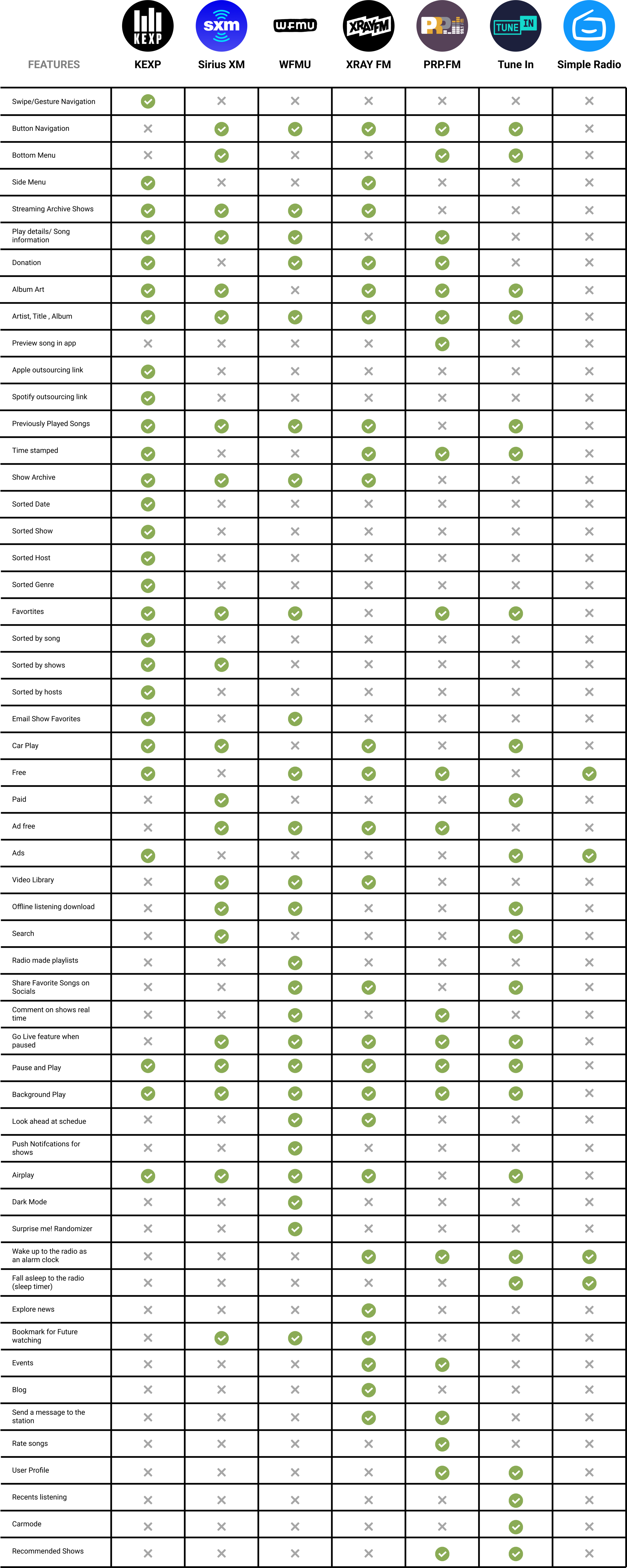
After categorizing the issues users are having with the app itself, I find it important to zoom out, and see how the app is performing against others in its own market. I went to conduct a competitive market analysis on other popular radio apps. This type of analysis helps determine what makes other apps successful, what sets them apart from the competition, and what they are doing to attract and retain users. By studying these trends and best practices, I can use that information when iterating on the KEXP app to make improvements and set themselves apart from the competition.
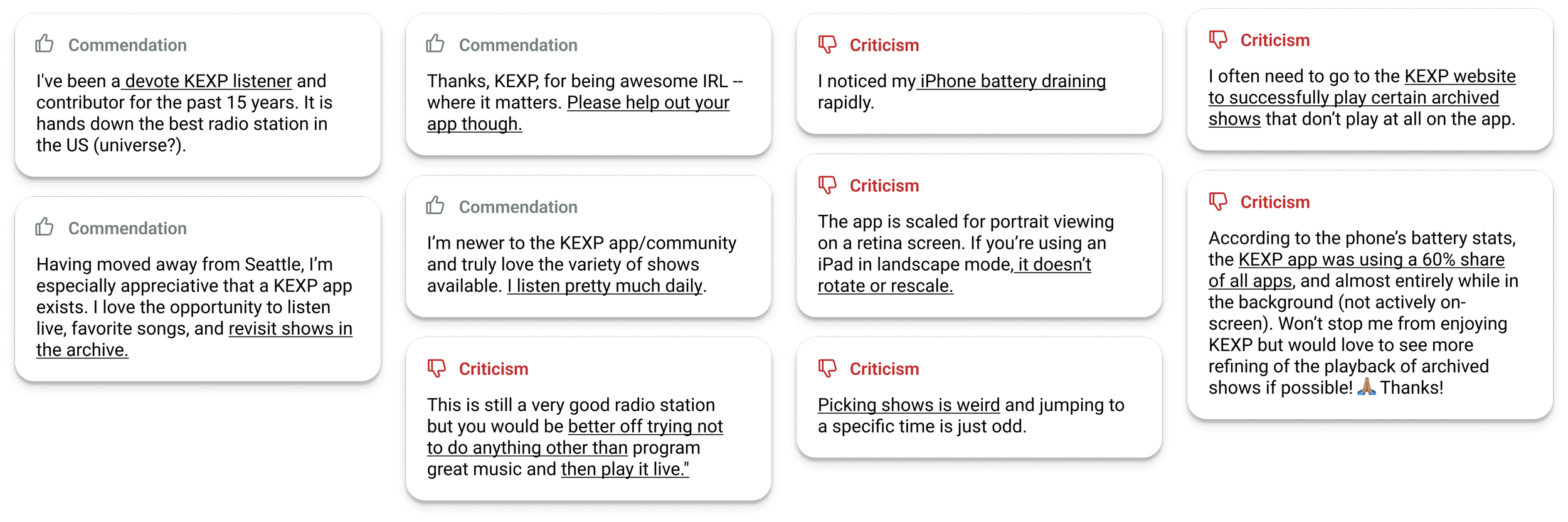
The common sentiment in these reviews is that while the users appreciate the content provided by KEXP, they have issues with the functionality of the KEXP app, specifically with the show archives and the user interface. The app is described as buggy, inconsistent across devices, not optimized for iPad screens, the app's UI to be inconvenient, causes significant battery drain, and has difficulties playing archived shows. Some users have resorted to using the KEXP website instead of the app.
User Feedback and Research
Market Analysis
Live User Feedback
Main Points From Discovery Process
Navigation:
Hit box being too small and requiring multiple clicks
Difficulty in clicking out of the side menu
Confusion between playlist being mistaken for upcoming queue
Swipe navigation being unintuitive and frustrating
Animation delay when swiping from one page to another
Side menu logo being hard to initially read and unintuitive
Visual Design:
Small time stamp denoting past is easy to overlook
User bias towards Spotify in terms of bottom menu, queue and details
Small and low contrast buttons for organized shows and favorites
Back button in the details drop down for a song appearing as a music icon
Grey play button not standing out
Beautiful album art being covered by buttons
Next, I focused on improving the overall functionality of the app. I considered what was already standard in the market, what users were requesting, and what unique features could set KEXP apart. I adopted an expansive mindset, realizing that we could always narrow down the ideas later. I generated a variety of ideas and then used an impact-effort matrix to prioritize and choose which features to tackle that would make the most impactful changes first.
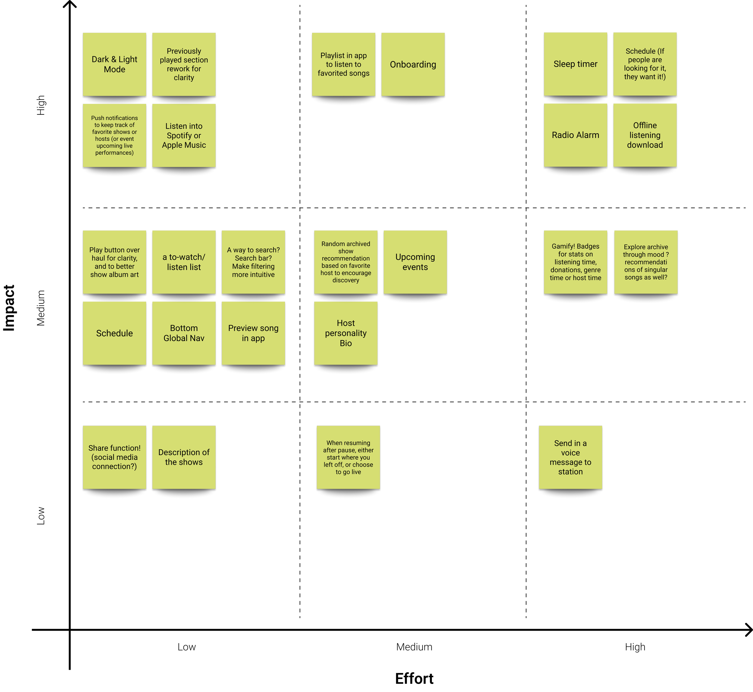
I concluded that the most effective way to enhance the user experience, based on all the user feedback and research, would be to implement an onboarding or first-run experience that familiarizes users with the features available and to revamp the interface to make it more clear, responsive and intuitive.
Based on the notes taken during the user interviews, users experienced several issues when using the KEXP app for the first time. One of the biggest issues was the unintuitive navigation and confusing design. The side menu, represented by the logo, was hard to locate, and the sliding feature was not intuitive. Some users thought that the calendar was to see future shows, and others thought that the songs shown in the show information area were the queue of what's to come, rather than previously played songs. There were also some concerns about the small and low-contrast timestamp for previously played songs, as well as the lack of clarity on how to navigate back to other screens. Users found the sliding navigation to be unintuitive, and expressed frustration with small buttons and multiple presses required to navigate within the app. They also expressed a desire for more intuitive navigation and a better overall user experience, often referencing Apple Music and Spotify.


I started by exploring how users felt about the product through online research. I looked at app reviews, forums, social media posts, and other sources to gather information. This is a summary of my findings:
Here are the discovered insights unearthed by exploring the following radio apps:
Sirius XM, WFMU, Xray, PRP.FM, TuneIn, and Simple Radio.
Key Takeaways
Impact- Effort Matrix
KEXP lacks offline listening, which not only has been requested by users but also is featured in other competing apps,
A search function would help users better take advantage of KEXP 14 day archive catalog, apps like Sirius XM and Tune In have this feature but other more direct competitors to the indie listener supported music scene like WMFRU and PRP.FM do not have this feature, and this would allow KEXP to stand out.
Other unique features such as sleep timer, and radio alarm clock, as well as recommended or randomized ways to explore archived shows, are used sparsely across competitors and implementation into KEXPs app could allow it to better stand out and provide more value to the user in terms of both novelty and practicality.


KEXP Original Home Screen
Design Process
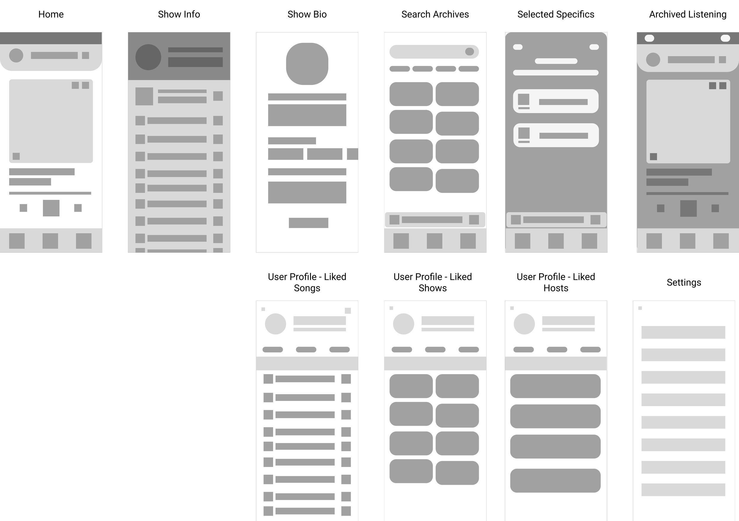
I began and crafted an outline map of the app's key pages. Although I had the desire to incorporate additional features such as in-app listening of favorite songs, a radio alarm clock, and a sleep timer, I restrained myself to prioritize the items with the highest impact and effort on the matrix. This ensures that the user's needs are met first and foremost. And I am reminded that in the future, there is potential for the app to expand and include these features.
Structure

Key Insights that Drove Changes Moving from Low to Mid Fidelity.
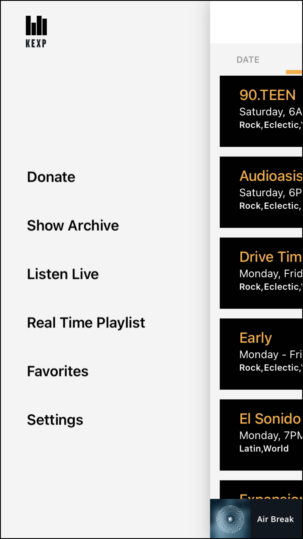
The logo was originally doubling as a sliding side menu in the app has originally. When ever the user clicked on this, if they recognized it as a menu icon and not just an app logo, they are first brought to the archives page screen as if they swiped up (their click wasn’t registered properly) and then they would have to click again to bring up the side menu, as shown on the side.
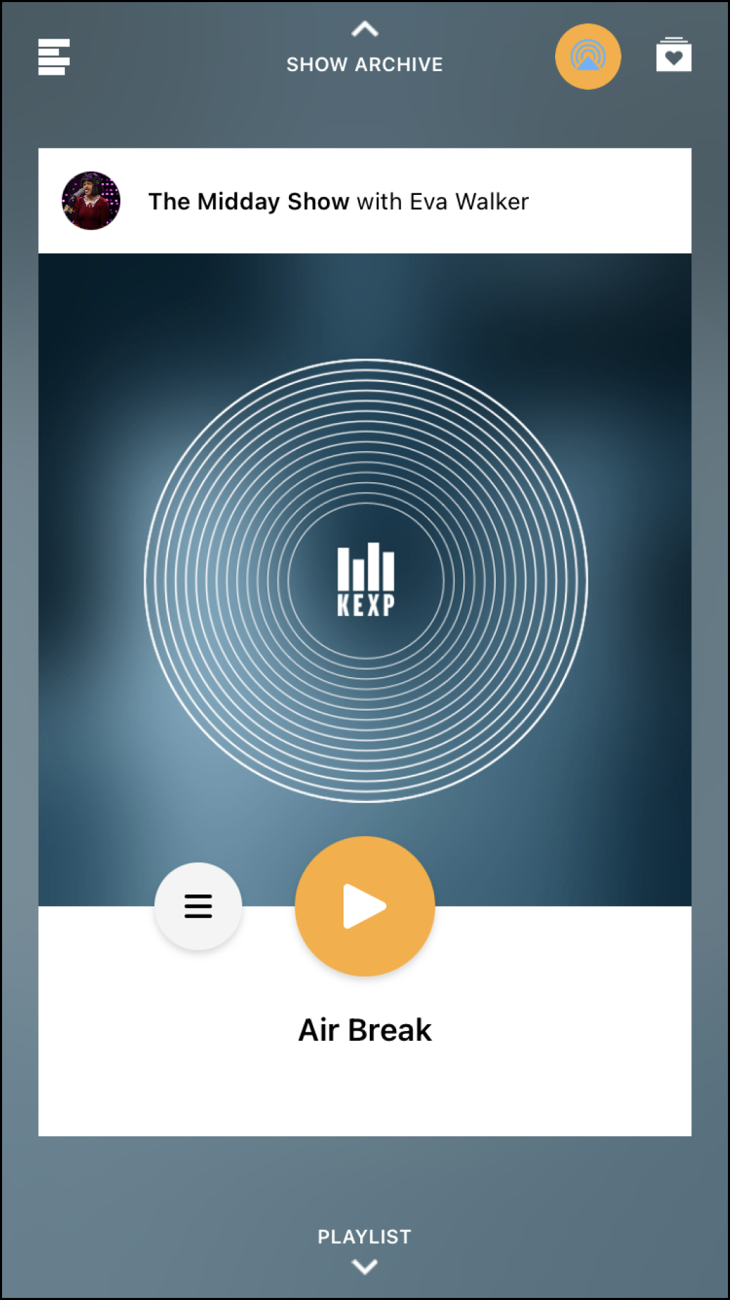
I made changes to improve the app's usability by replacing the side swipe menu with a fixed bottom tab navigation. This aligns with best practices in UX design, which favor navigation elements that are familiar and expected by users. Research by the Nielsen Norman Group also has shown that hidden navigation is less discoverable, used later in a task, and leads to a worse user experience compared to visible or partially visible navigation. This holds true across multiple metrics such as task difficulty, time spent on task, and task success. This will effectively help one of the major pain points for user which was unintuitive navigation.
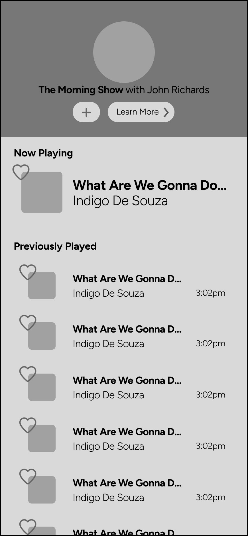
During the low-fidelity to mid-fidelity design process I improved the app's clarity by adjusting the information architecture when displaying previously played tracks in the show information section thus reducing the chance of user confusion.
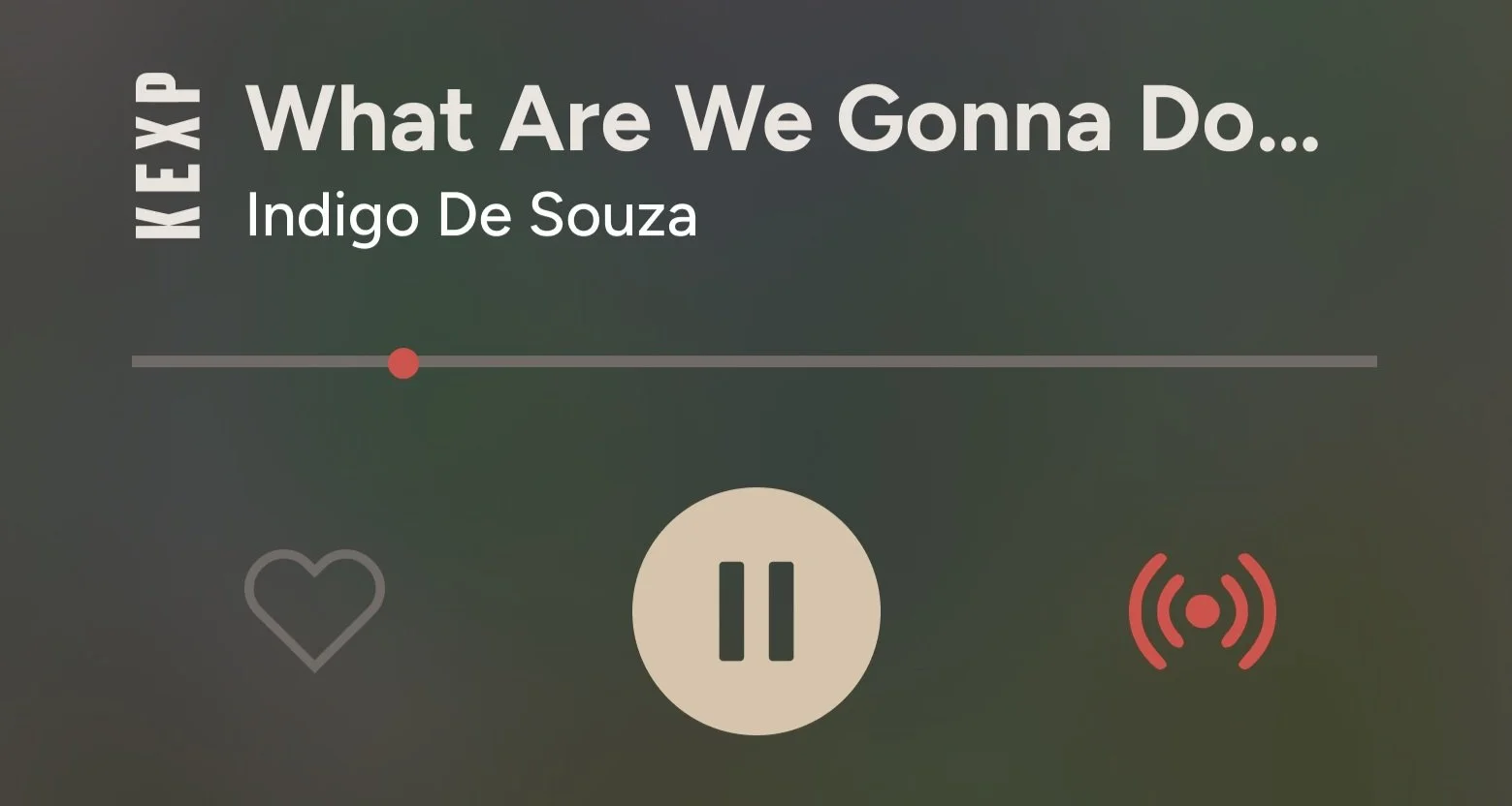
To further enhance the user experience, I added a fixed bottom play bar to display the current playing track and provide the user with an option to like or pause it. I also later included a way for the user to know if they are listening live or behind in the currently playing show.
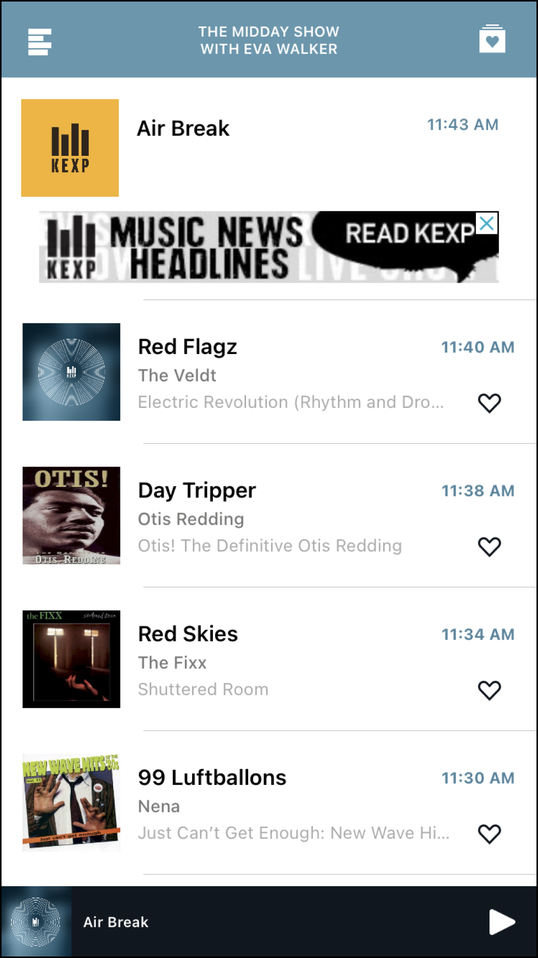

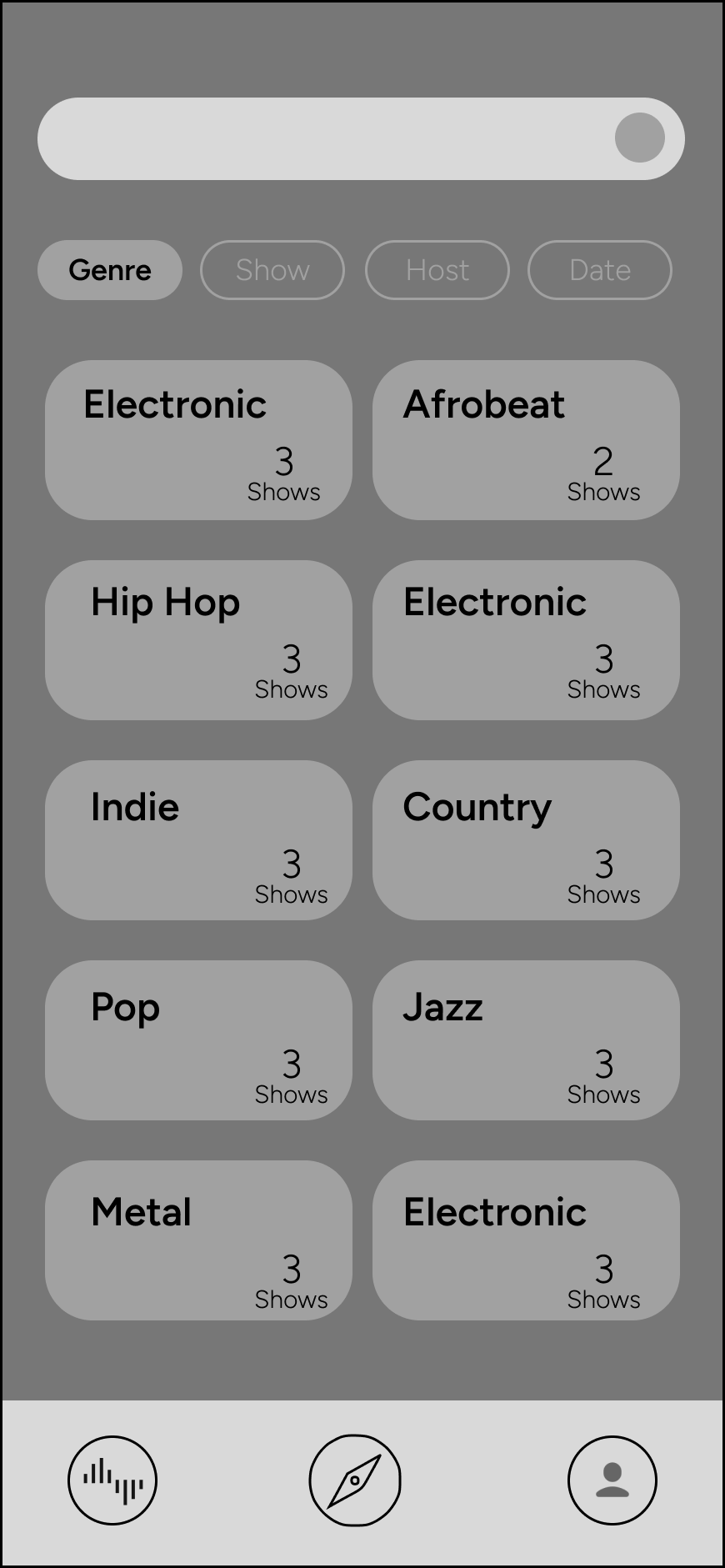
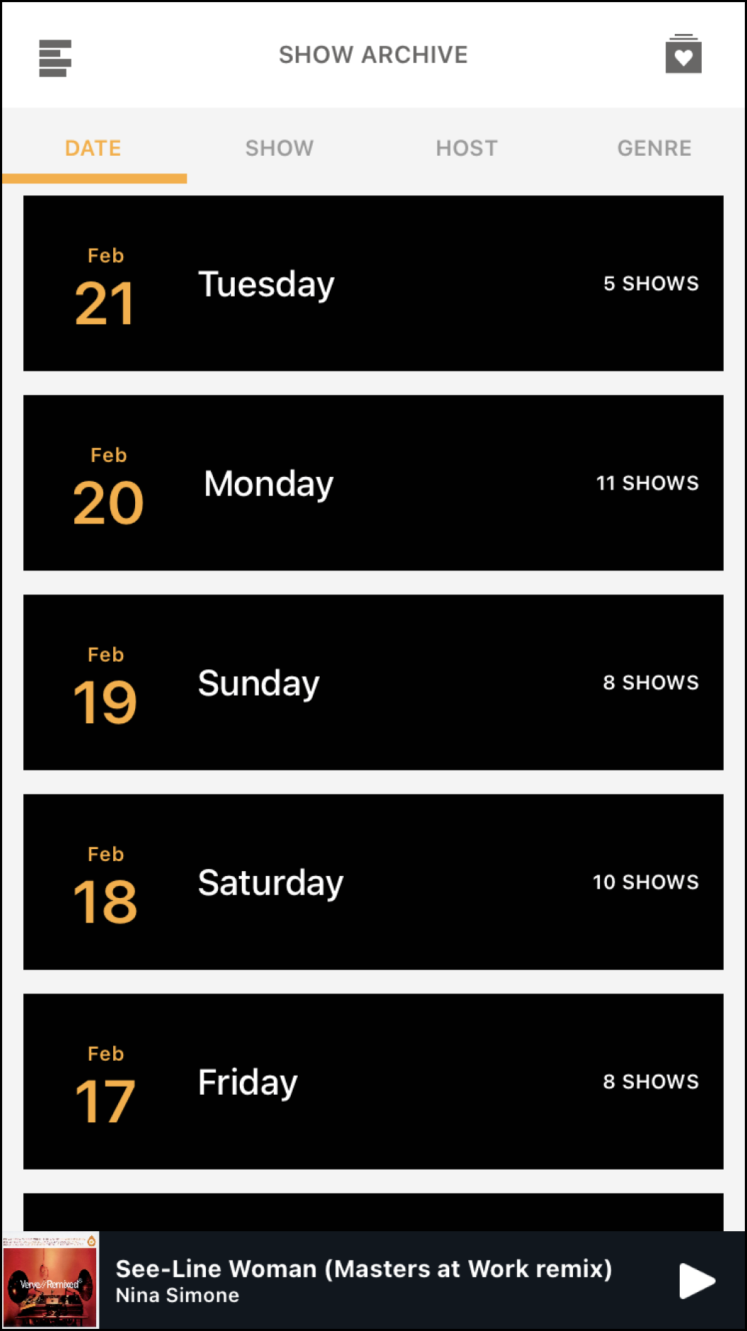
The search function within the explore archives section was added and the cards were reorganized.
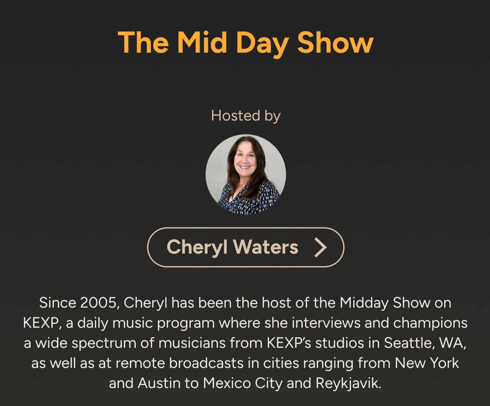
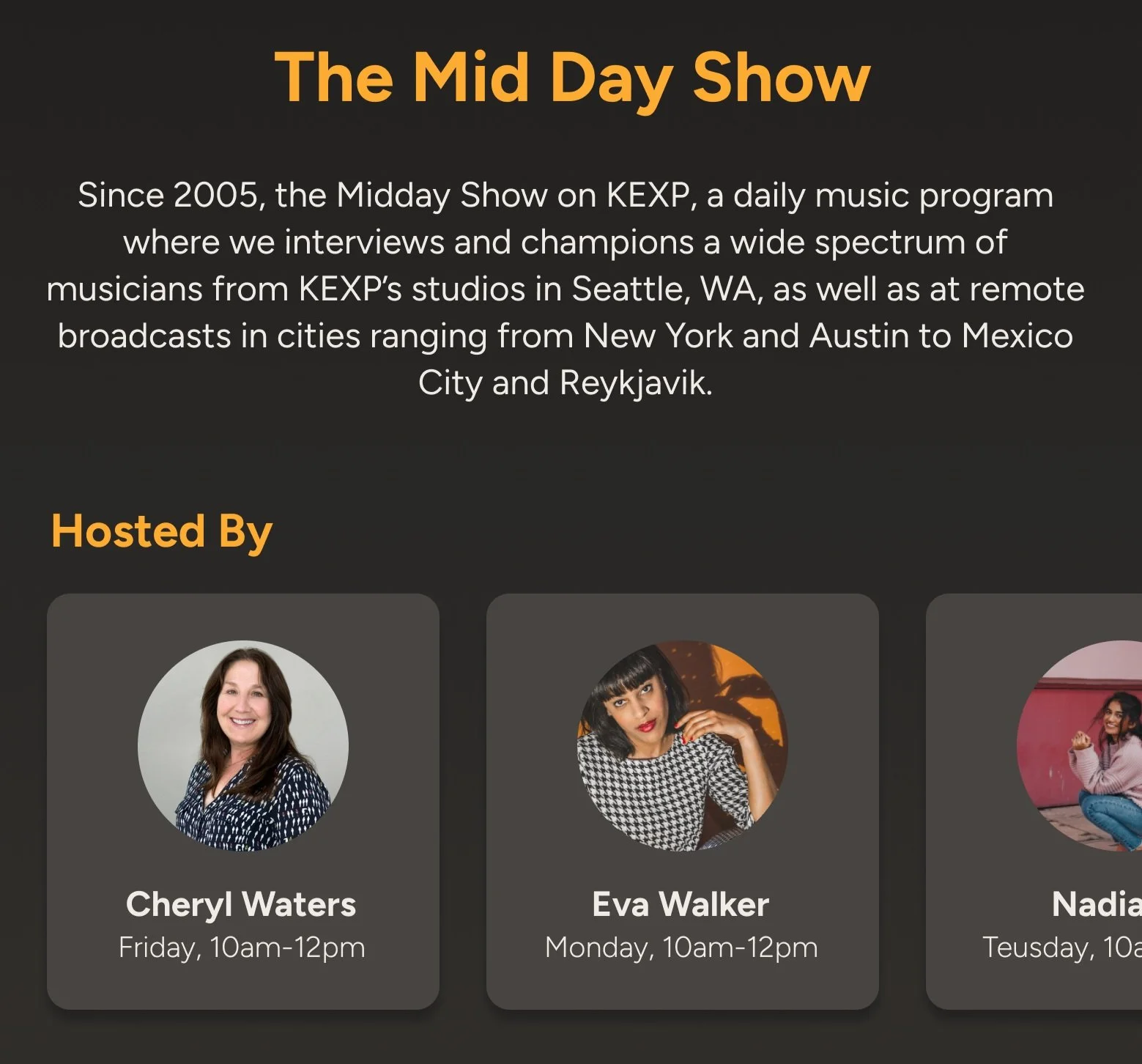
Note: As I was designing I realized, especially in the mid-fidelity to high-fidelity process, there is a repetitive amount of reused images shared amongst hosts and shows. So moving forward I would suggest that KEXP create unique branding images for each show to reduce the use of shared images between hosts and show cards. This would not only enhance the recognition of the hosts, which is currently the main attraction for the users, but also make each show more memorable by highlighting its own vibe and theme.
Now as the color way for the entire app is aligned with the KEXP brand and is easily recognizable I had a challenge in incorporating the KEXP logo itself into the app. I experimented with various patterns and watermark options. Finally, I settled on placing the logo fixed beside the song title and artist on the home music screen. In the show details and profile settings pages, I added watermarks for a consistent branding experience. This approach keeps everything concise and unified with the KEXP name, especially in the less branded settings page where fewer color elements are used.
Here are the low fidelity wireframes of those key pages:
Global Navigation for Ease of Use


Previously Played Clarity Rework

I fixed this issue by clearly categorizing the now playing, vs the previously played, and giving them hierarchical differences. That along with the time stamp will clearly communicate to users that this is what was previously playing in this radio show and give them the chance to gather information if they were interested in a certain song and add them to their favorites.
Are You Listening Live?


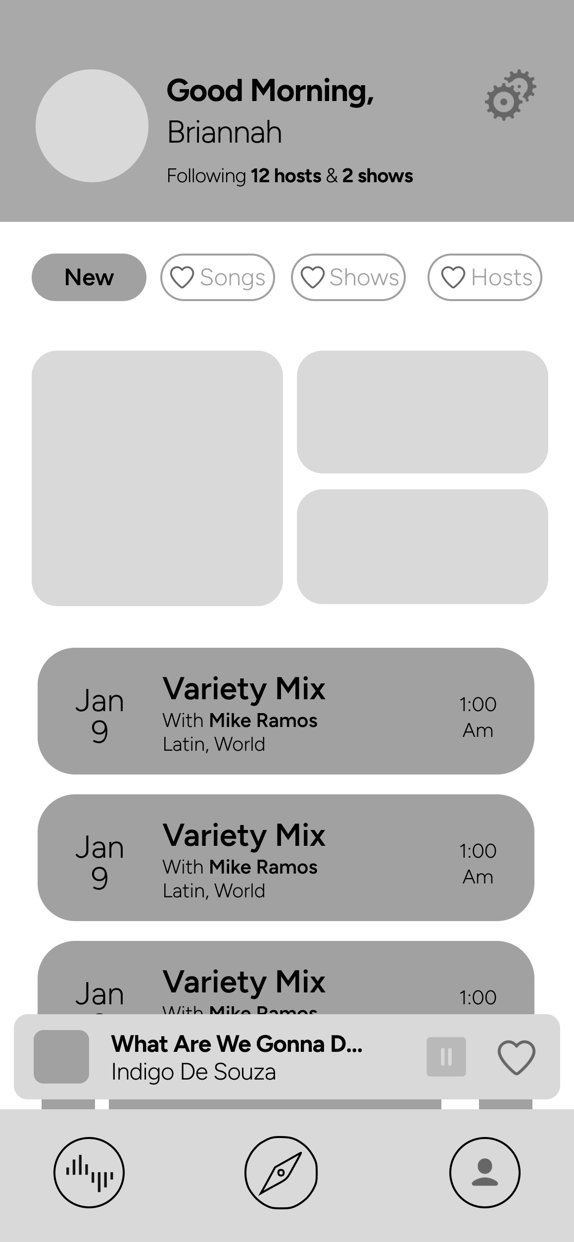
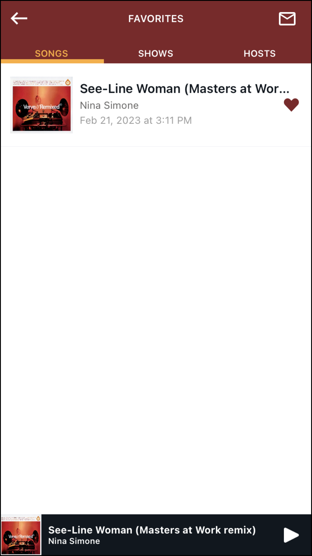
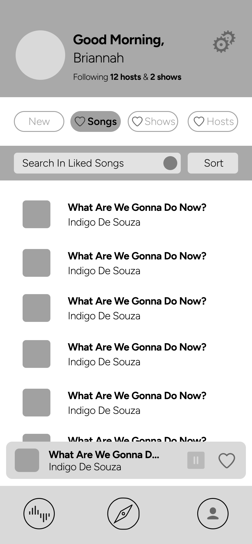
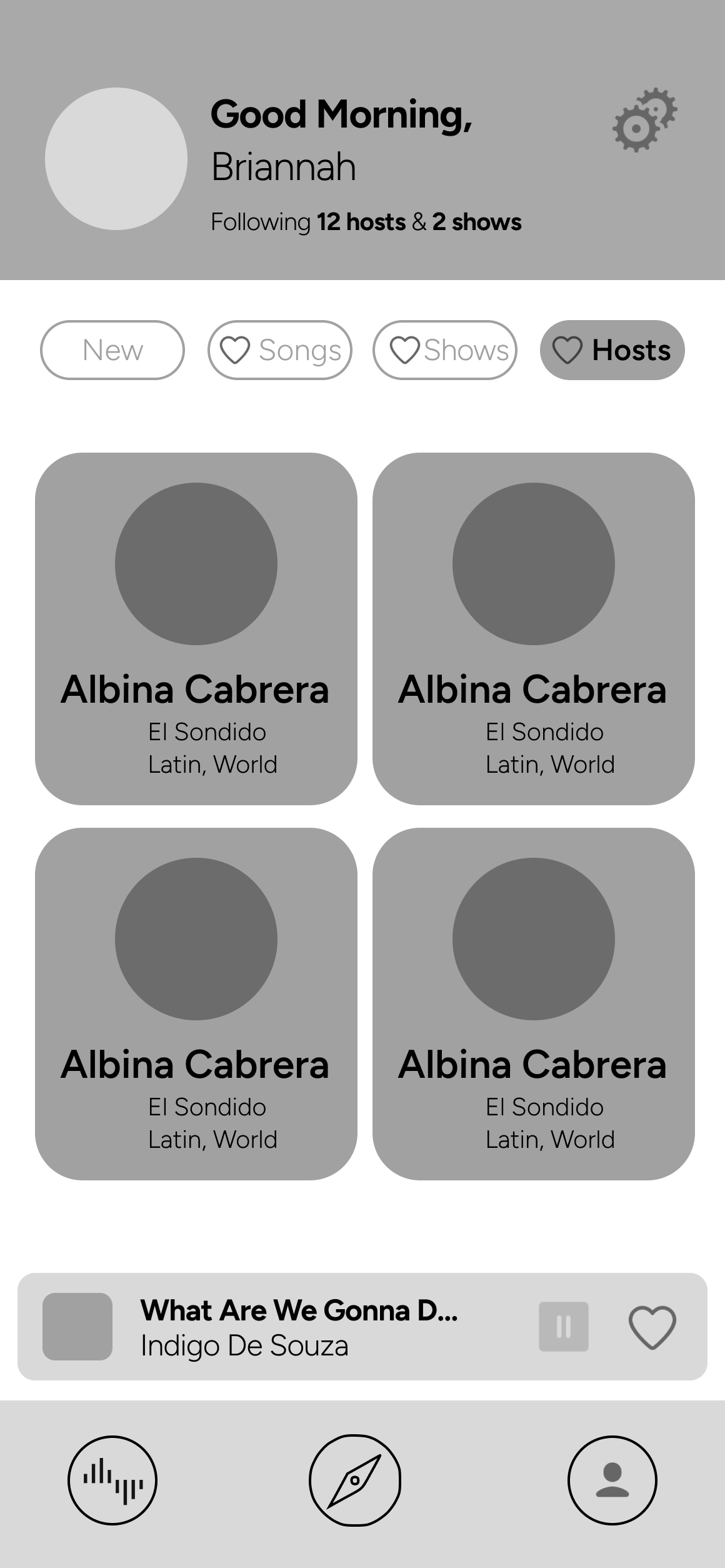
I revamped the favorites section to function more like a profile system which included liked songs, shows, and hosts. I also included a section for newly added archived recordings to showcase recent additions from the users favorite shows or hosts. ( I also believe that adding a push notification system for when a show or host a user is following is on air or about to go on air would be very valuable ) Finally I decided to ax the inclusion of the date from the liked songs list, and take the Spotify/Apple Music approach and auto sort by date liked without specifics and give the user the choice to either search or sort through their likes by song title, artist name, or reverse date added.
Previously, There was no denotation between what was currently playing, and what was previously played in this section of the show information. This combined with the user bias many had in which they expected the songs showing to be a queue for what was to come (similar to Spotify and Apple Music) led many to be confused about what they were looking at. The only element leading them to believe this was previously played was the time stamp on the side of the songs going backwards.
Problem
Mid-Fi Solution
Problem
Mid-Fi Solution

Like Button and Go Live Button Interaction

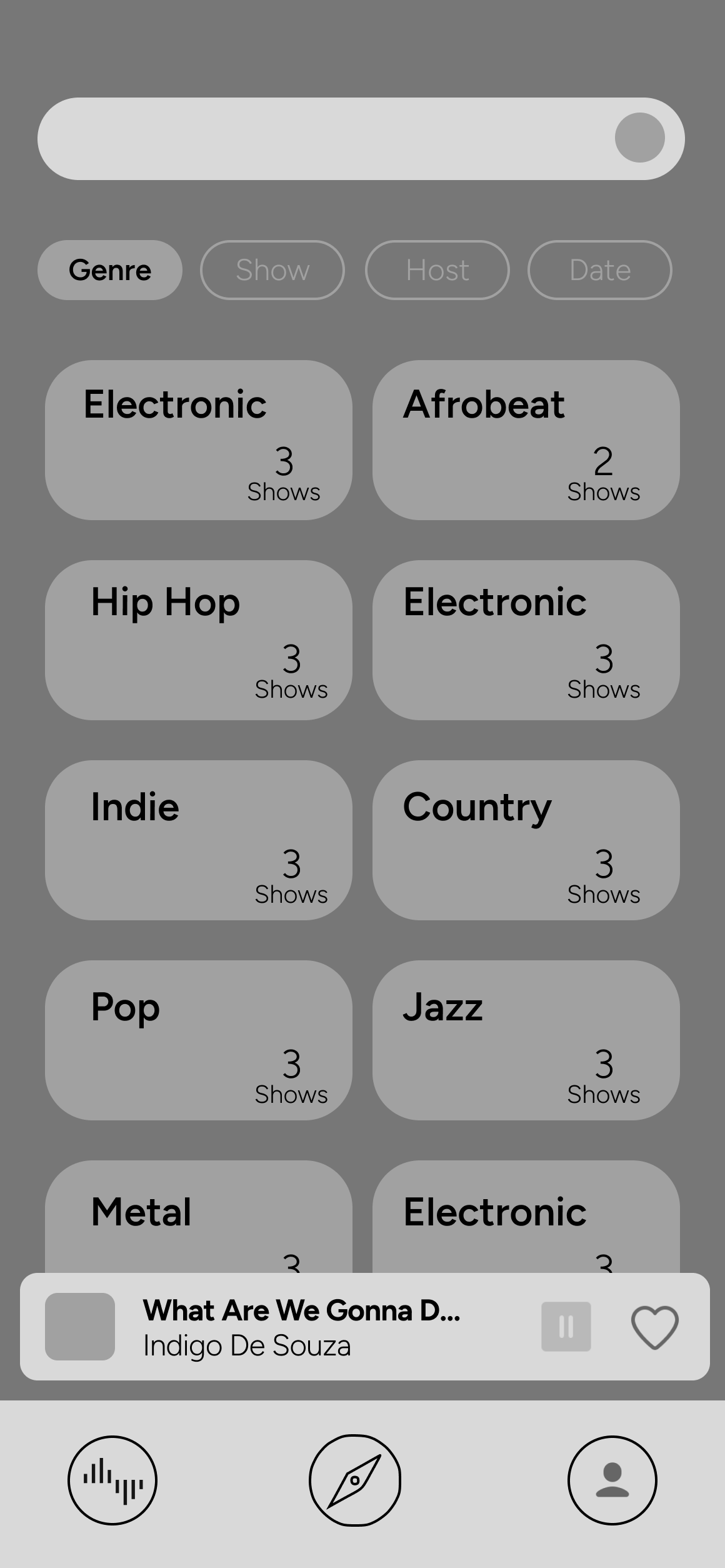
Search Function to Encourage Discovery in Archive Listening
The solution was to include a search bar to encourage exploration of the archived shows through tags or key words. The fixed global navigation allows it to be more accessible to reach this part of the app intentionally (rather than by accidental swipes or misread presses on the side menu) and will also be a constant reminder of this part of the app through out usage.
There was no way to search within the 14 day backlog archived selection other than simply sorting and scrolling between the four different areas of date, show, host and genre. This is such a lovely feature to have but as it stands it is not easy to explore.
Problem
Mid-Fi Solution

User Profile Revamp
Problem
Mid-Fi Solution
Catching Problems
I encountered a challenge during the design process of the app's pages and content. I initially overlooked the need for a section to display multiple hosts cards, as many of KEXP's shows have different hosts. I realized my mistake when I cross-checked the design against the actual app. I'm glad I caught it and was able to rectify the issue, highlighting the importance of double-checking one's work.
Multiple Host Cards

Application of Branding and Color


Design Solutions
On-Boarding Ideation
I followed best practices for designing an onboarding sequence, with the goal of making a connection with the users and showcasing what KEXP means to them. I simplified the process of creating an account and then quickly introduced the app's functionality, allowing users to select their preferred genres and choose hosts they may already know. This creates a personalized feel while the app loads archive recommendations, which is one of the app's hidden treasures. During this time, an animation showcases the main features. I wanted to share with users and provide them familiarity with before they dive in. Finally, the user is given the option to listen to an archive show selected for them based on their preferences or listen to the live show currently playing on KEXP in real-time.
Here is the reveal of the final app! Moving forward I would like to conduct testing to see what users' experience of this app is on a first run first use environment, and then iterate from there. This will provide valuable insights for future iterations and improvements. Additionally, there is potential to enhance the listener's experience even further by pulling from big dream features and adding new ones by referring to the impact-effort matrix such as an alarm clock feature to wake up to a live KEXP show, the ability to share links, or a detailed calendar view of special shows and musical events. By continuously seeking ways to add value, we can ensure that the app remains a source of enjoyment for KEXP listeners.
Before showing the final screens, I'd like to share the thought process behind developing the onboarding/first run sequence. My goal was to make the app more user-friendly by introducing a fixed navigation bar at the bottom to help users access different areas and features with ease. This addressed the common problem of users struggling to find the menu and navigate the app. However, I still wanted to provide an onboarding sequence that briefly introduced the main features of the app, such as liking hosts, shows, and songs, as well as the options to listen live, switch from a non-live listening to a current show, and listen to archived shows.

