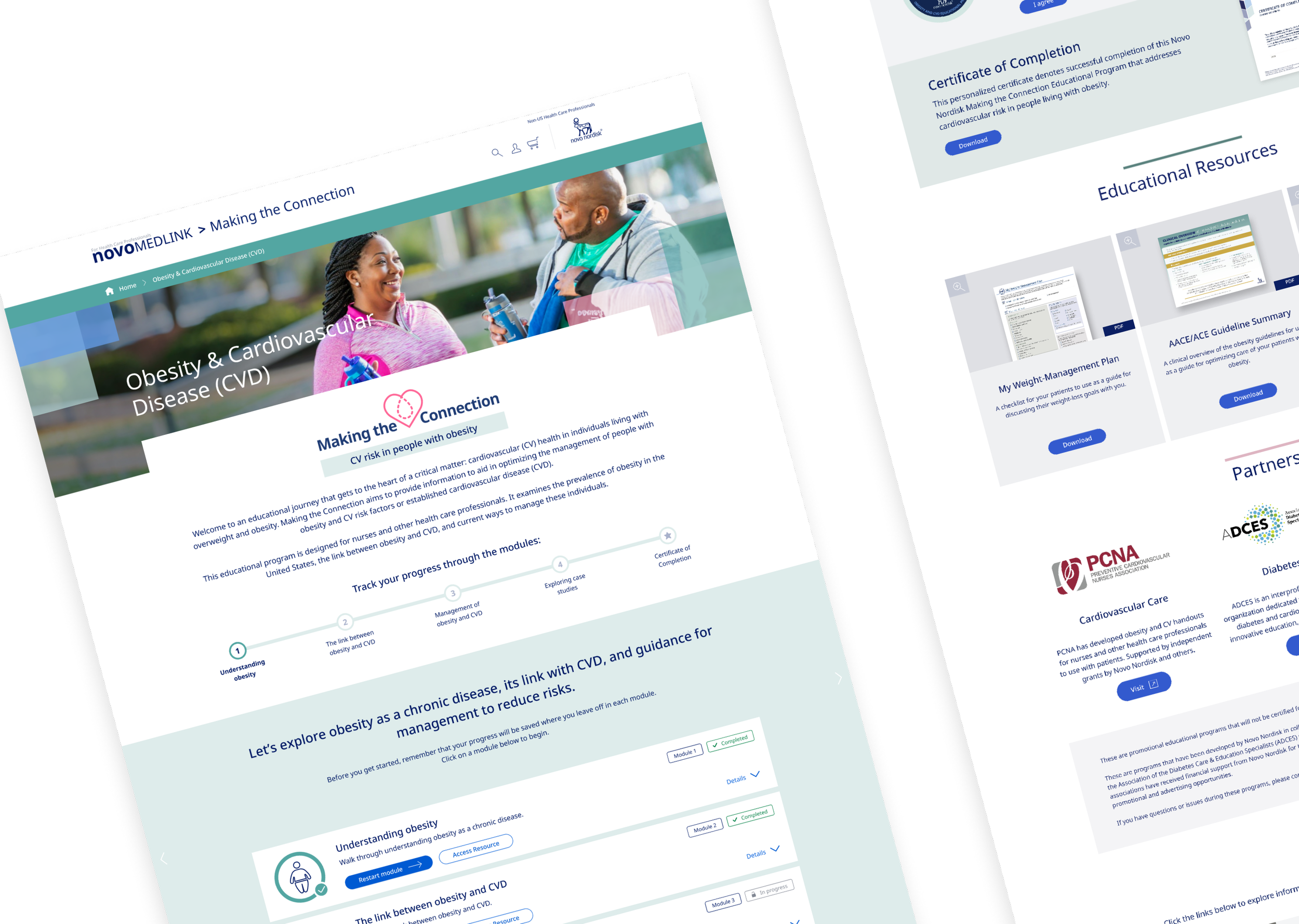
Designing for Engagement in Healthcare Education—Making the Connection Microsite Revamp
This case study explores the challenges of redesigning and educational experience including scalable templates before final content was available, reimagining site navigation, and enhancing user engagement within the constraints of scope and resources
Key Deliverables:
Revamped navigational experience
Interactive learning features
Mobile optimization
Project Overview
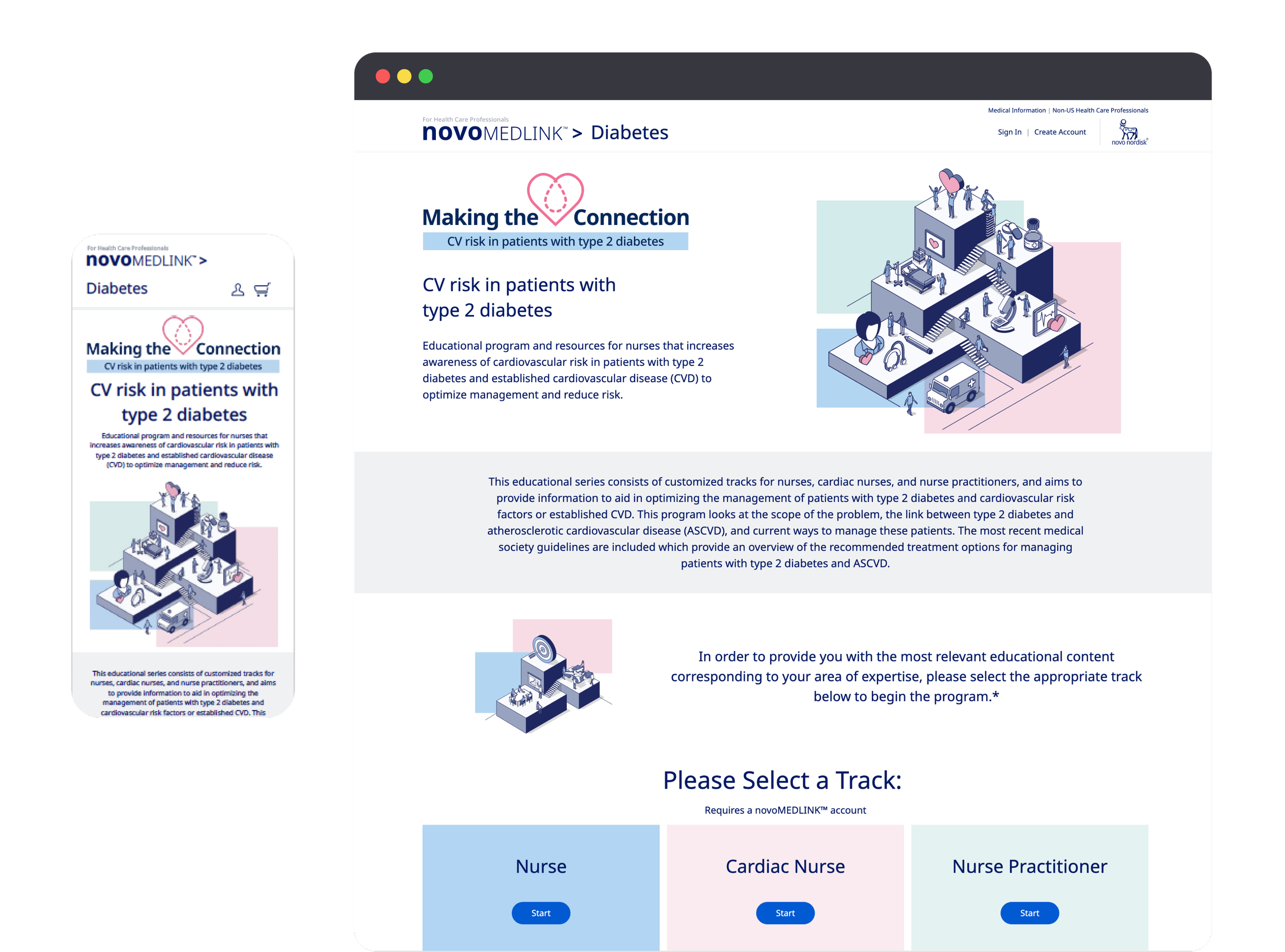
Novo Nordisk's Making the Connection microsite is an educational platform for healthcare professionals, particularly nurses, focused on diabetes and obesity management. Despite its importance, the platform suffered from poor engagement, clunky navigation, and a lack of interactivity, issues that were especially pronounced on mobile devices. Our goal was to revamp the user experience, create a scalable design, and introduce interactive learning elements to help improve engagement and learning outcomes.
The Initial Problem: Why Revamp the Site?
The original site was struggling with several key issues that hindered its performance:
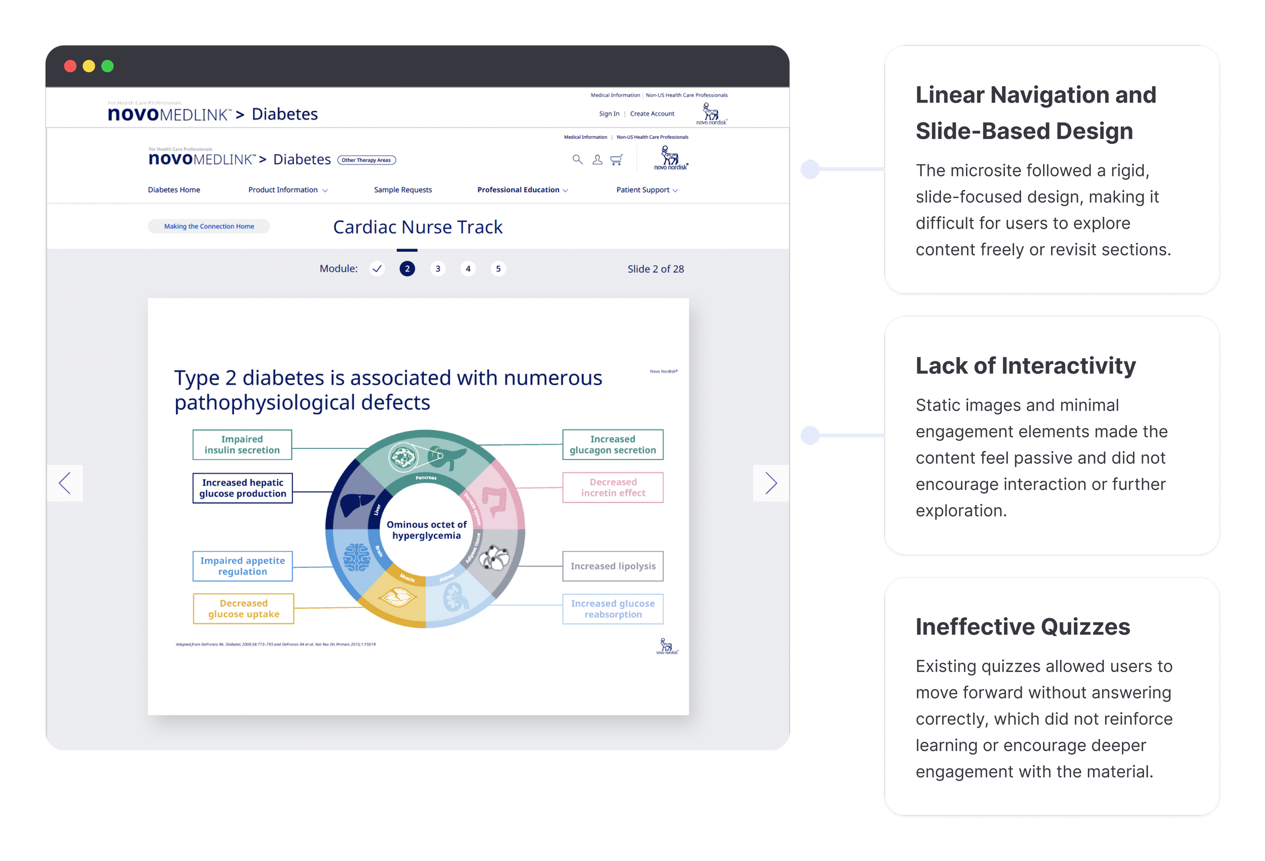
All Alongside A Poor Mobile Experience.
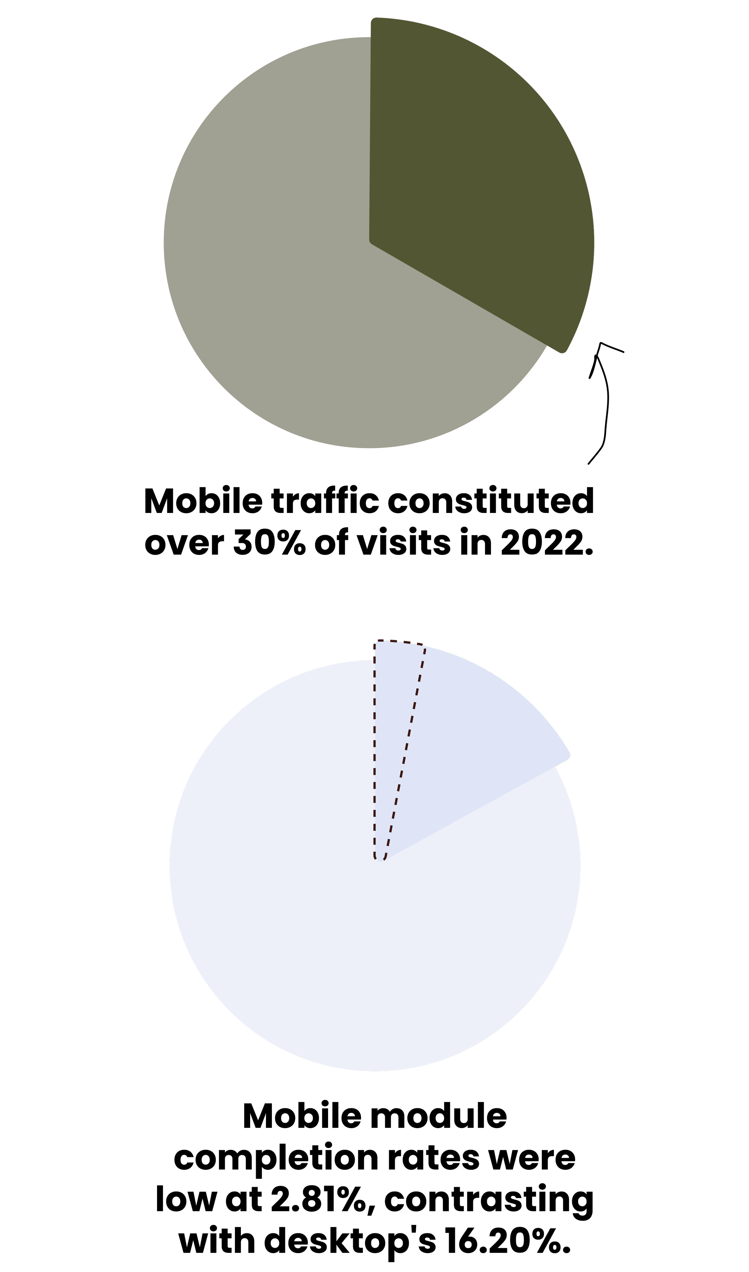
Mobile traffic constituted over 30% of site visits in 2022, yet the mobile version was not fully responsive. On mobile, the average session duration was just 1 minute and 34 seconds, compared to 6 minutes and 42 seconds on desktop. Completion rates for mobile users were only 2.81%, compared to 16.20% for desktop users
These metrics clearly demonstrated the need for a more user-friendly, engaging, and mobile-optimized site.
Increasing Engagement Through
Interactive Learning - Goals

Enhance time-on-site and completion rates:
Introduce quizzes and interactive modules, to encourage users to engage more deeply with the content.

Restructure the Site Navigation for Two Learning Tracks:
Create an intuitive navigational structure that allows users to move easily between educational tracks and access unlocked resources as they progress.

Create Scalable, Interactive Templates:
Develop content templates that could scale as new educational tracks were added to the microsite, minimizing future development time.

Provide a Rewarding & Seamless Learning Experience:
Simplify navigation and introduce a resource reward system, unlocked as users progressed through educational modules, in order to create momentum.
Research & Early Insights
Industry Best Practices
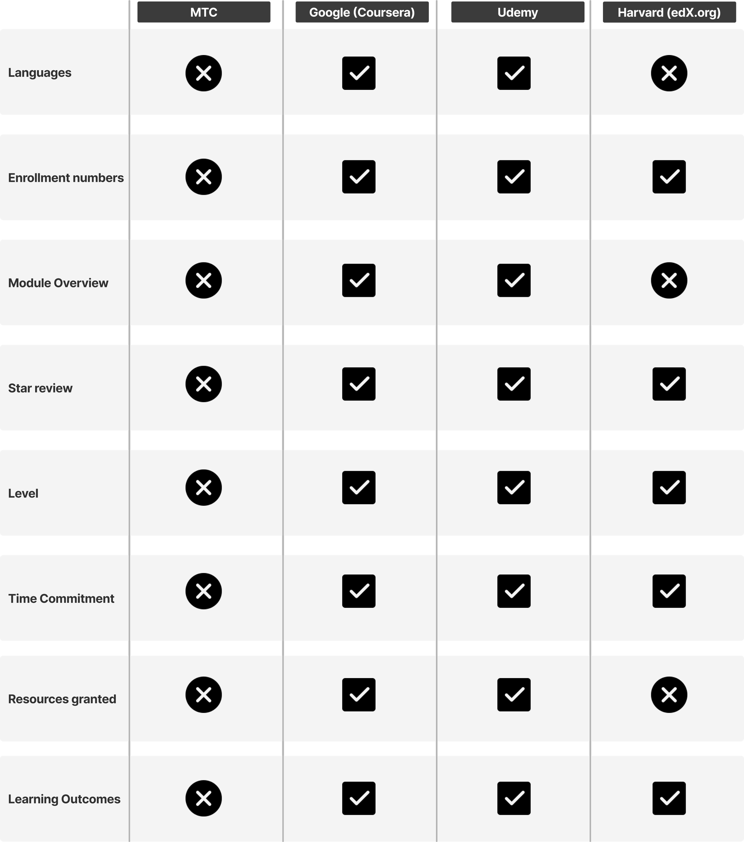
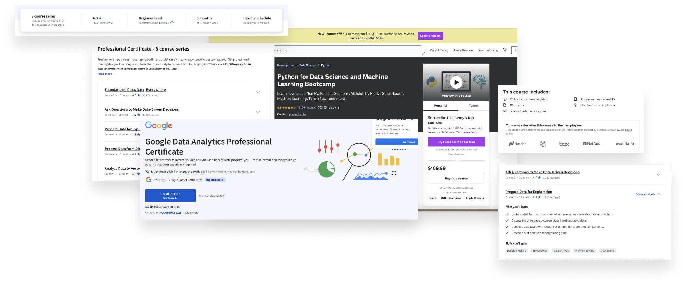
Before diving into the design, we researched key online learning platforms like Coursera, Udemy, and Harvard Online Learning. The findings helped us understand where the "Making the Connection" site fell short and how we could bring it up to speed with user expectations.
Key Takeaways:
Progress Tracking: Platforms like Udemy provide clear progress trackers, which we aimed to incorporate into the new navigation bar.
Interactive Features: Engaging quizzes and dynamic content were best practices for creating successful educational content.
Designing for Flexibility
The Wrapper Before the Candy
One of the major challenges we faced was that the content for the educational modules were being developed by a separate agency, while we were tasked with designing the framework. This meant building a flexible system, like a wrapper, that would eventually hold the “candy” (the final content).
Our solution was to develop five scalable, interactive templates that would easily adapt to future content updates and modules.
Navigating the Constraints: Building Flexibility
Creating Five Scalable Content Templates
We explored a variety of template options, including full-screen video layouts, interactive image-based templates, and content with embedded quizzes. After some back and forth, we narrowed down the options to five key templates that balanced usability with visual appeal.
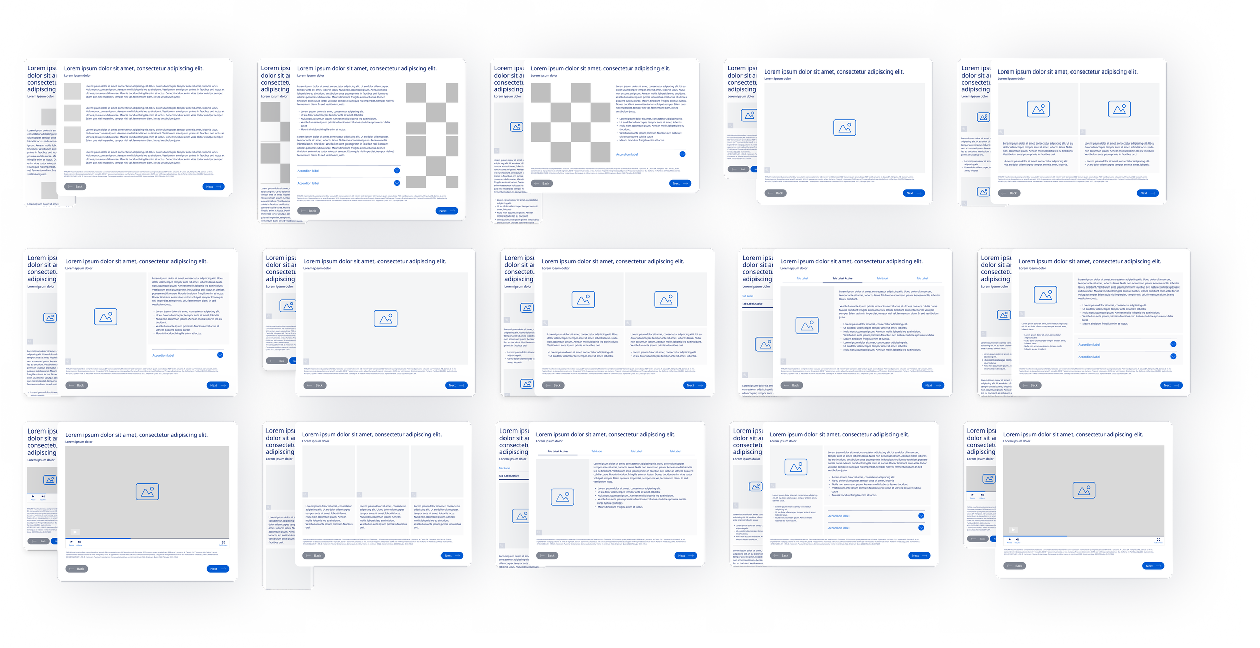
In the end we designed five flexible, reusable templates that would work across various types of content. This would help ensure that the microsite could have longevity and adapt to content needs as educational content and learning tracks evolve.
Full video template
Full-width image template
Left-aligned content with accordion interactivity
Three-column image content stack
Tabbed image content groups
These templates introduced interactive elements like accordions and expandable content, creating a more engaging experience that encouraged users to explore deeper into the educational material.
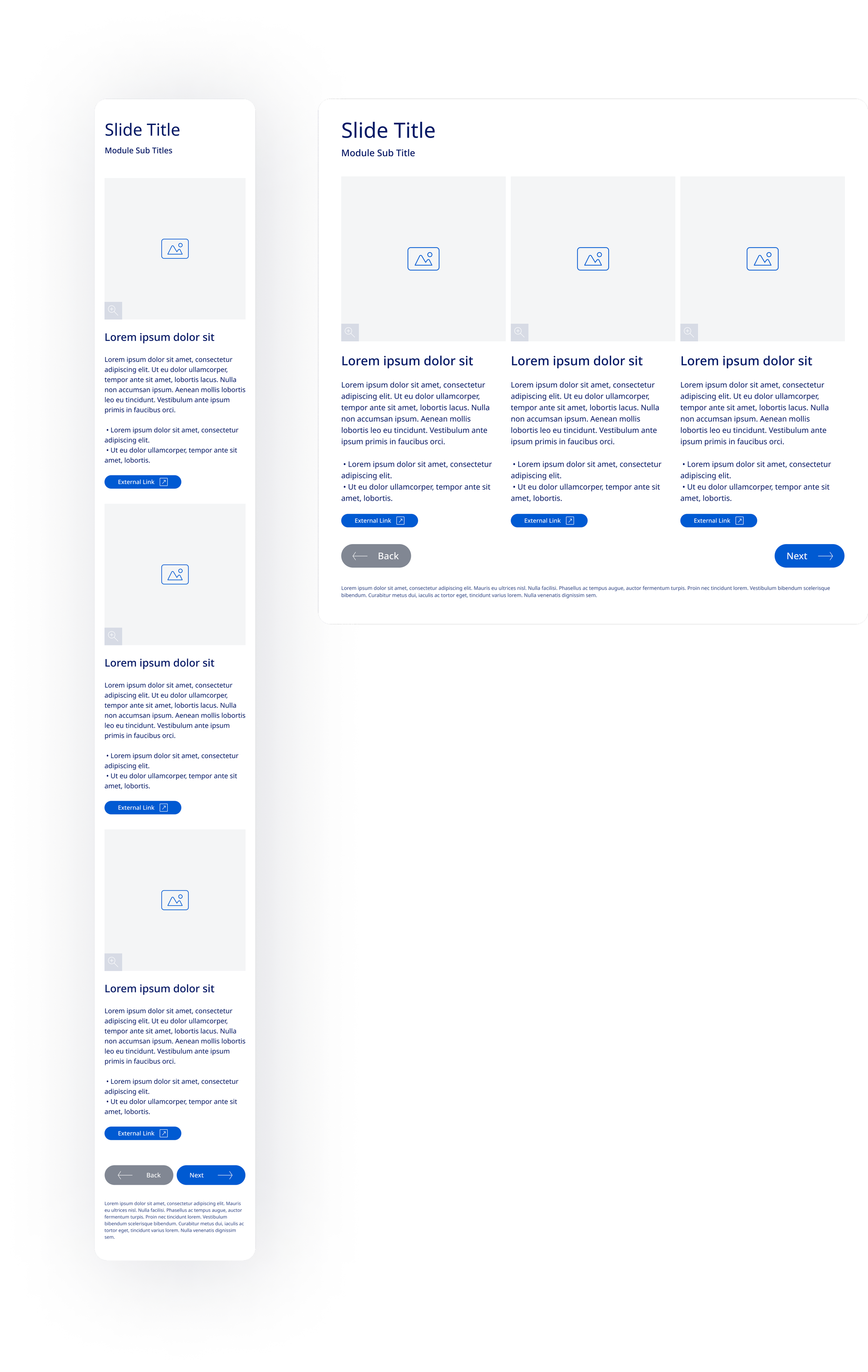
Three-Column Image and Content Stack
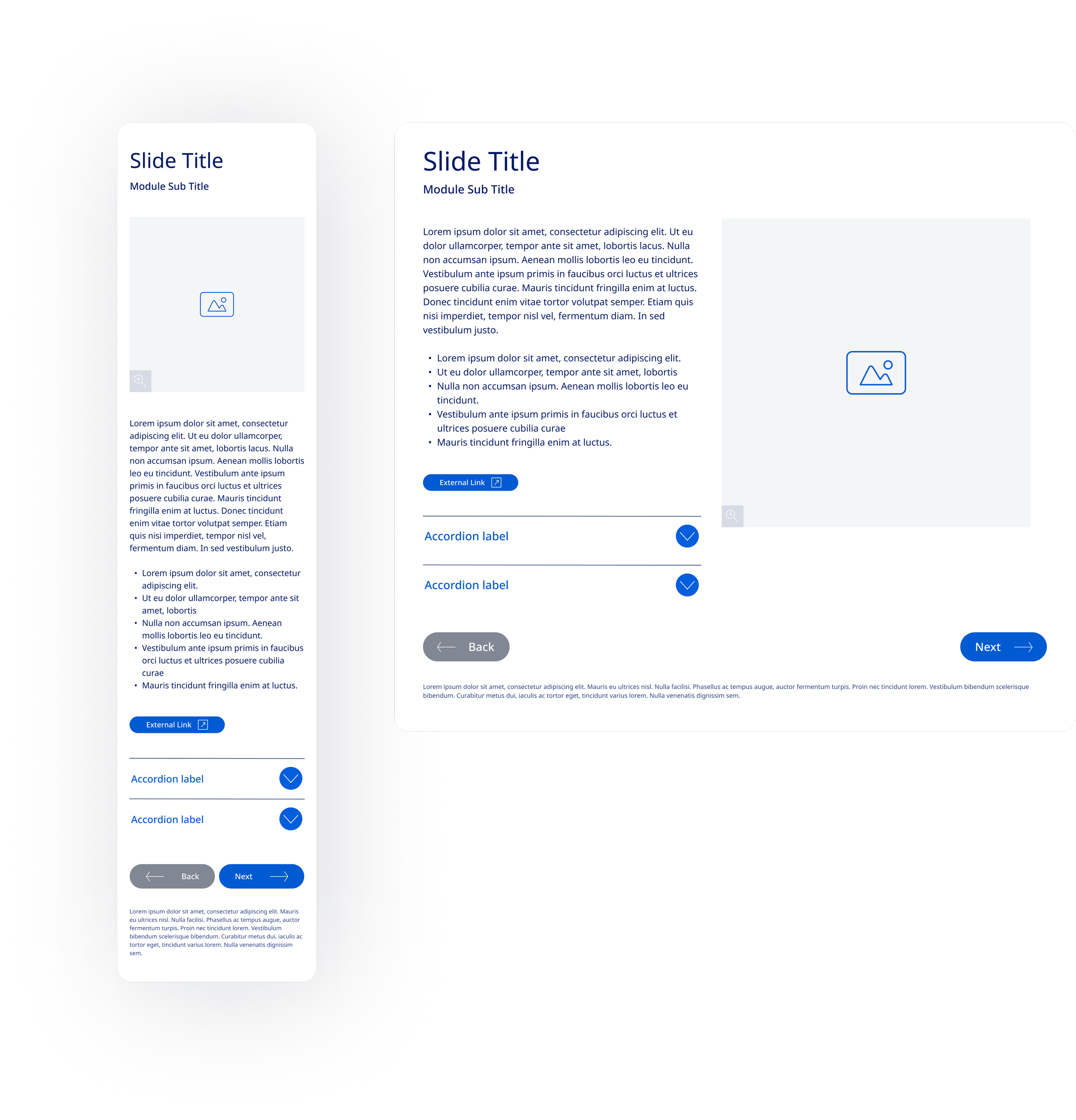
Left-Aligned Content with Accordion Interactivity
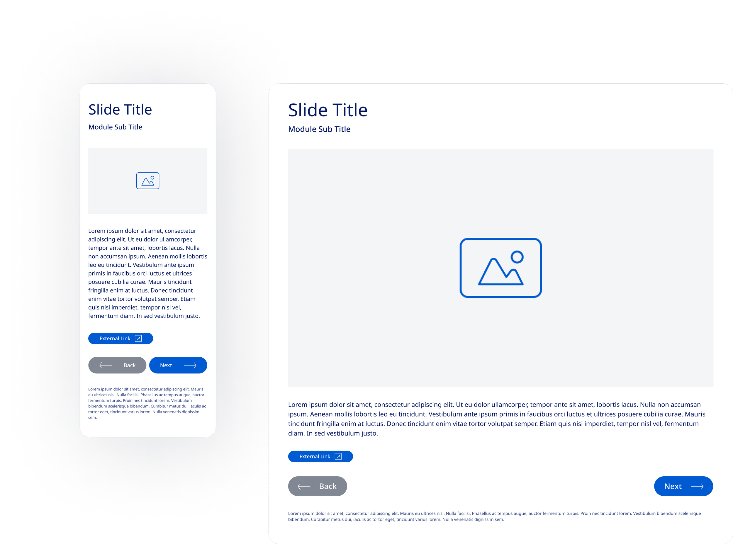
Full-Width Image Template
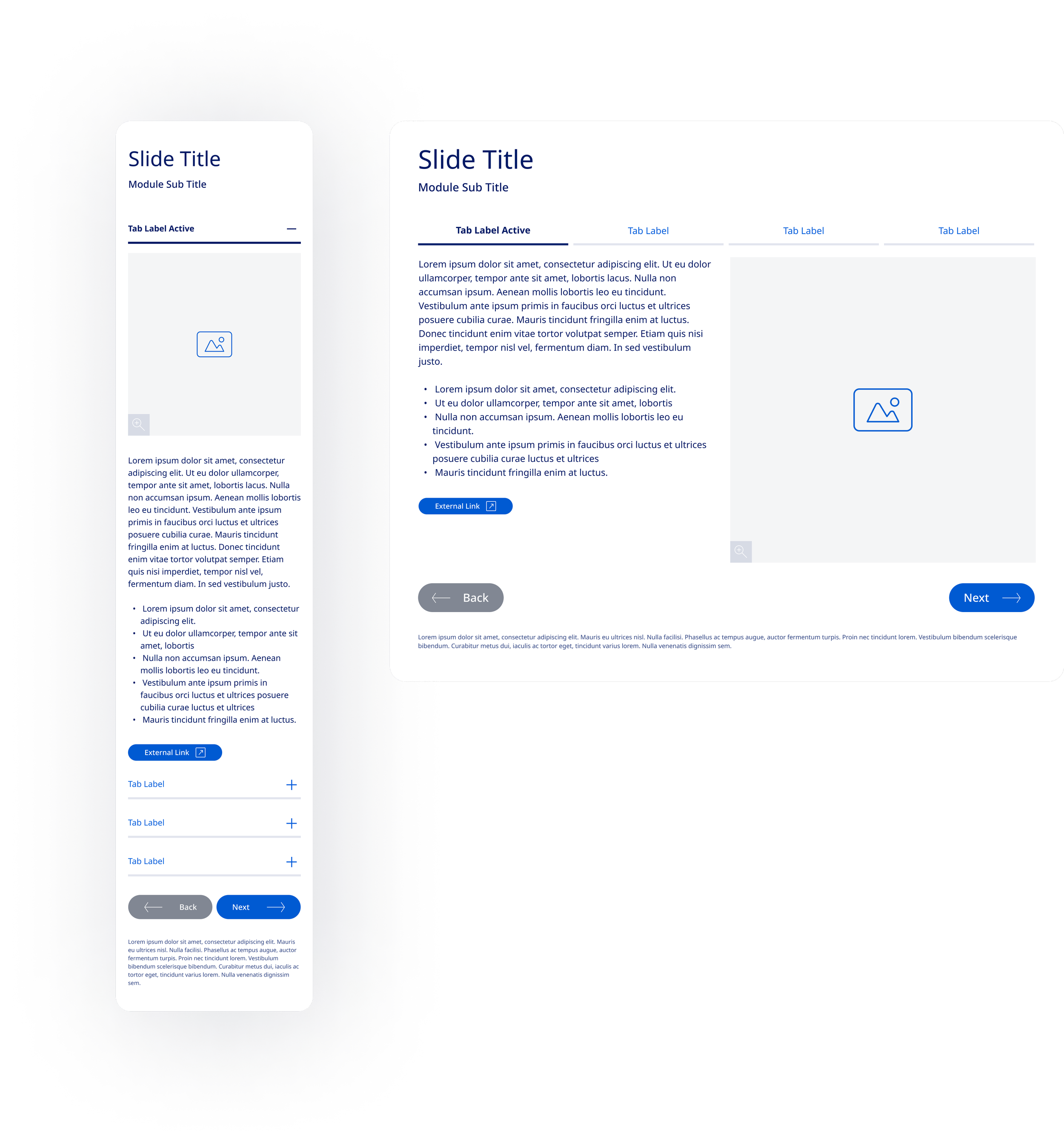
Tabbed Image Content Groups
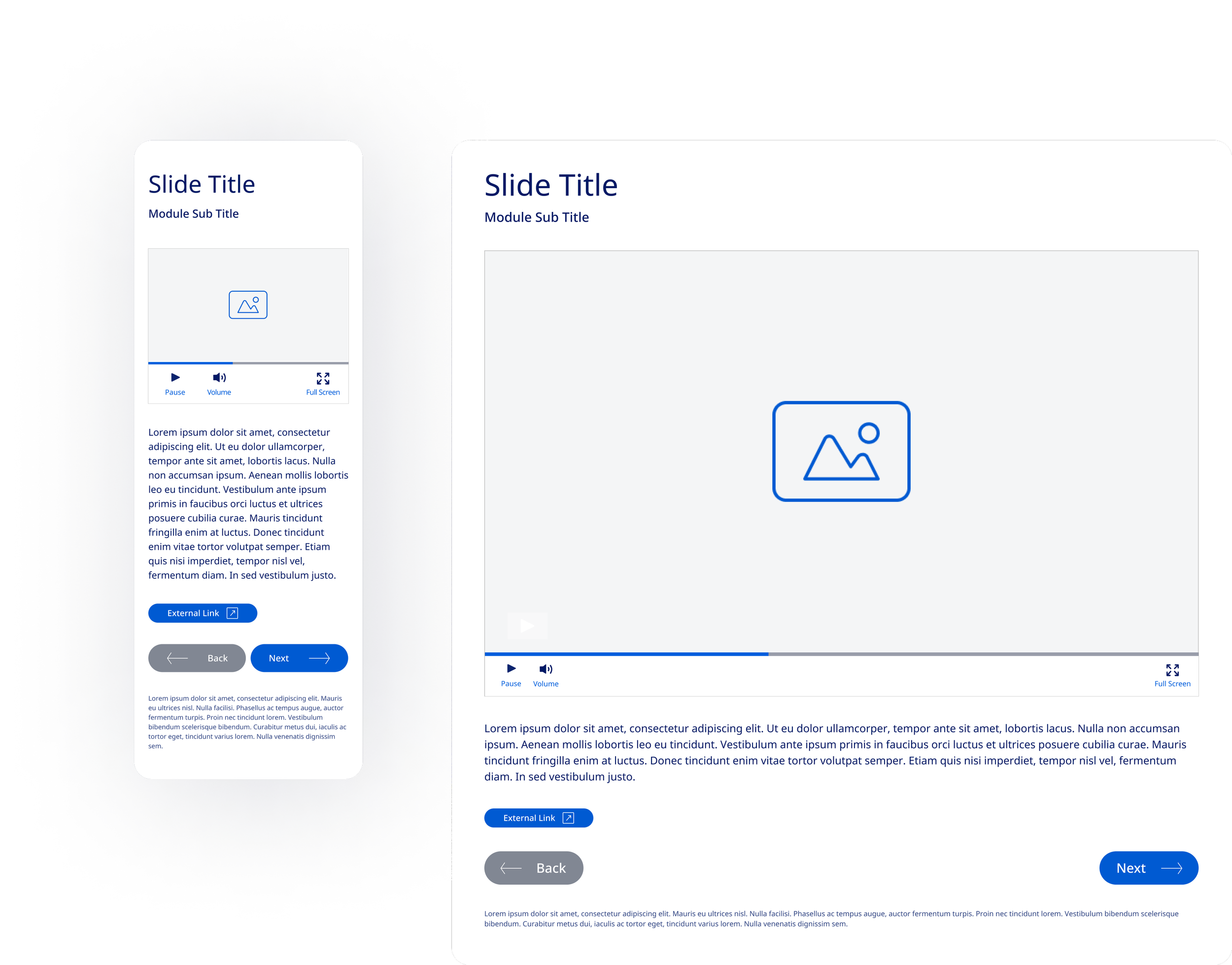
Full Video Template
Site Navigation Overhaul: Creating a Multi-Track Learning Experience
Two Educational Tracks and Resource Page Integration
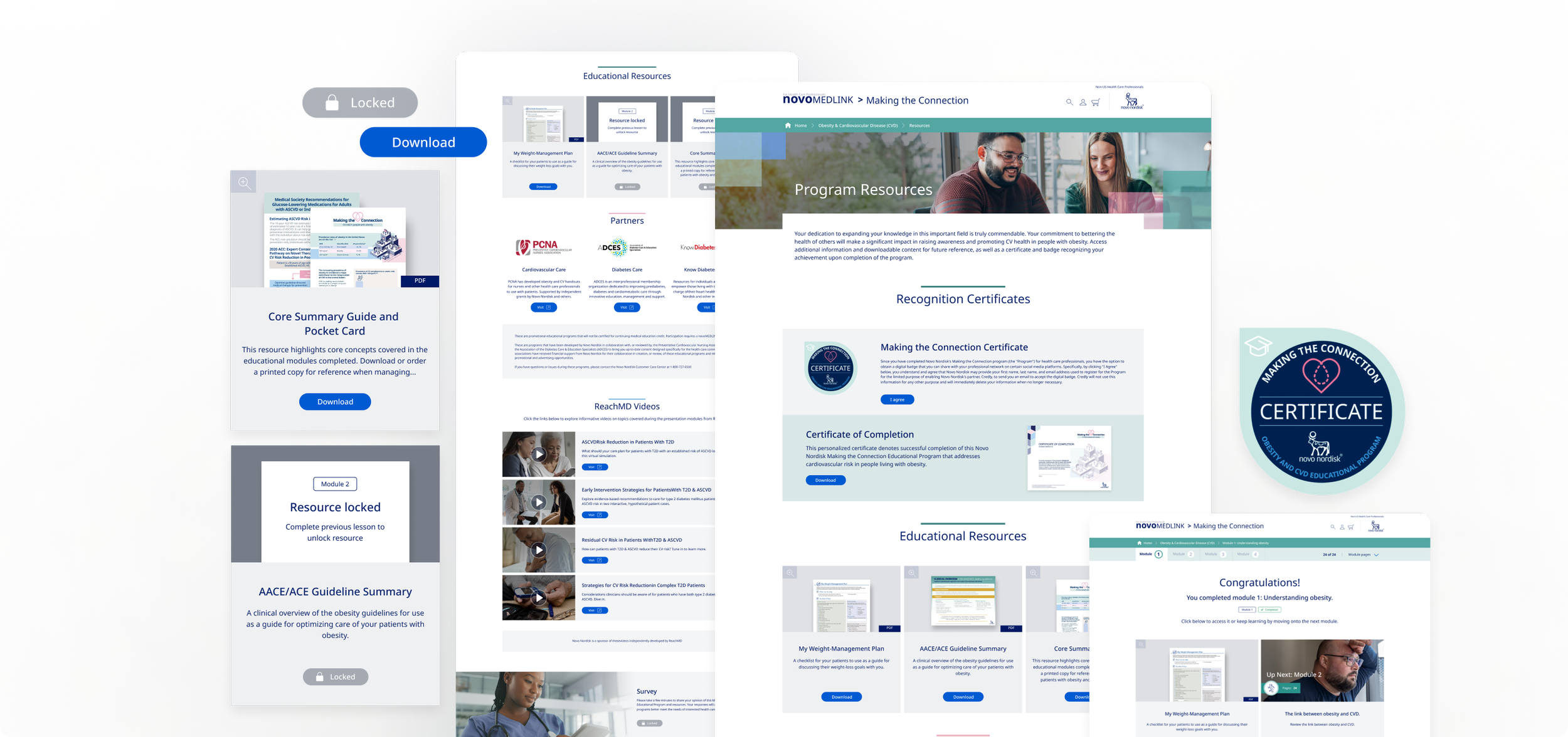
We restructured the navigation to support two distinct educational tracks. The new system allowed users to easily switch between tracks while having easy access to high-level progress markers with each. We also introduced a resource page where users could access general educational materials and track-specific resources unlocked upon module completion, adding a reward system to the learning process to help improve learning outcomes.
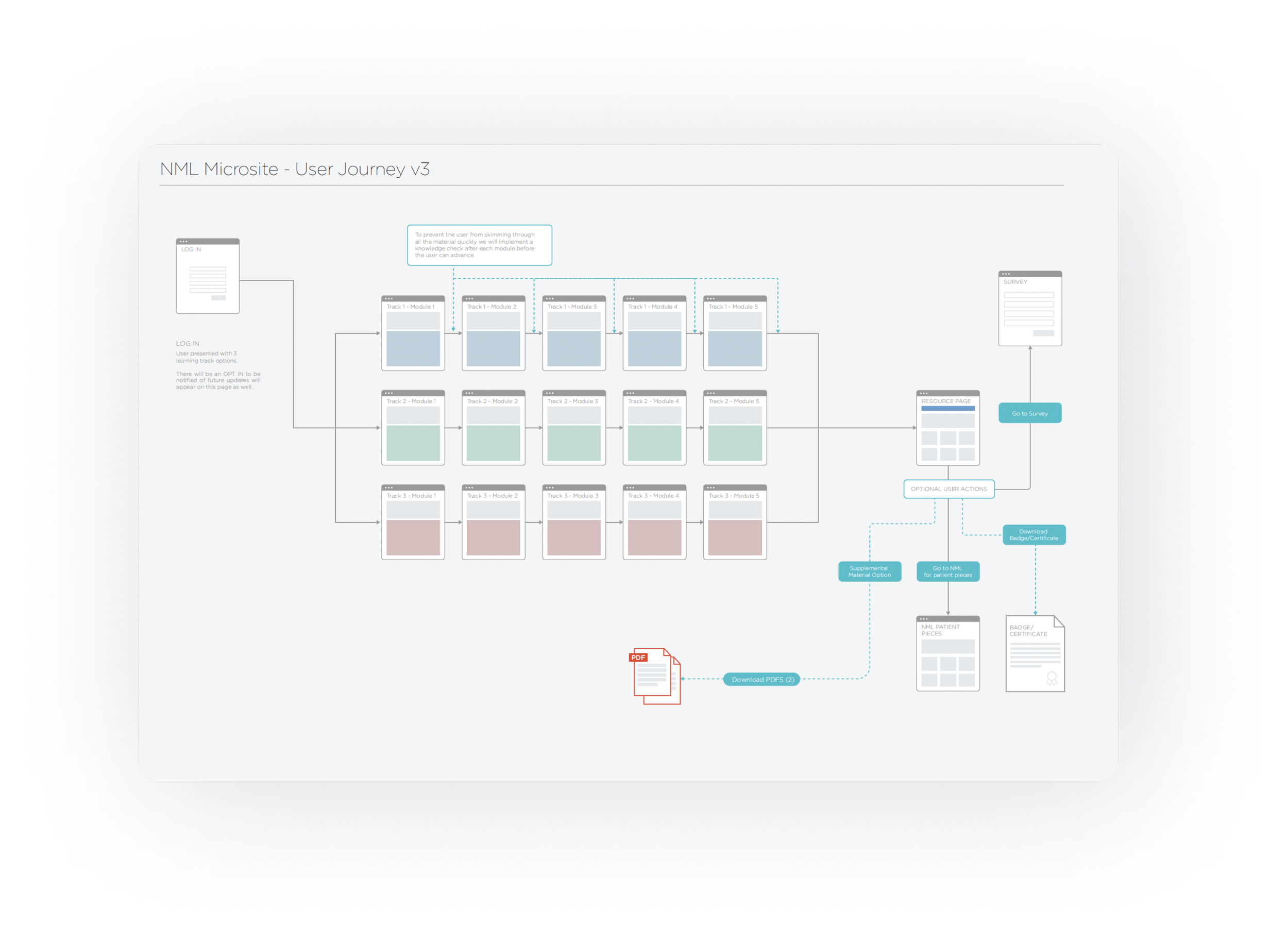
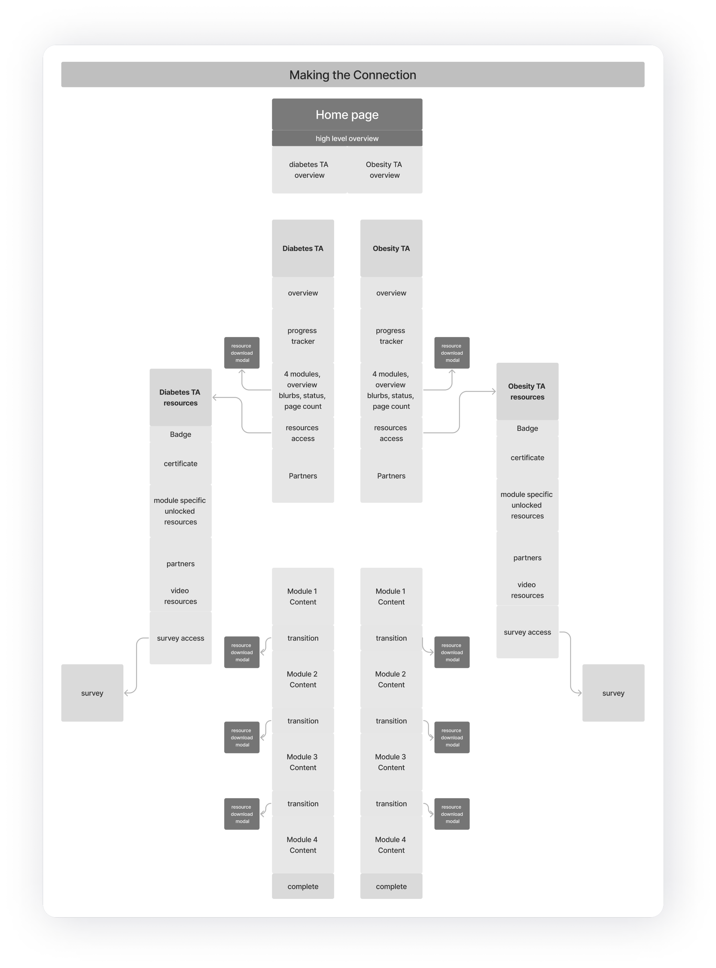
Revamped Home and Landing Pages
The homepage was reimagined to serve as both a dashboard and an entry point for the learning tracks, making it simple for users to continue courses or explore unlocked content.
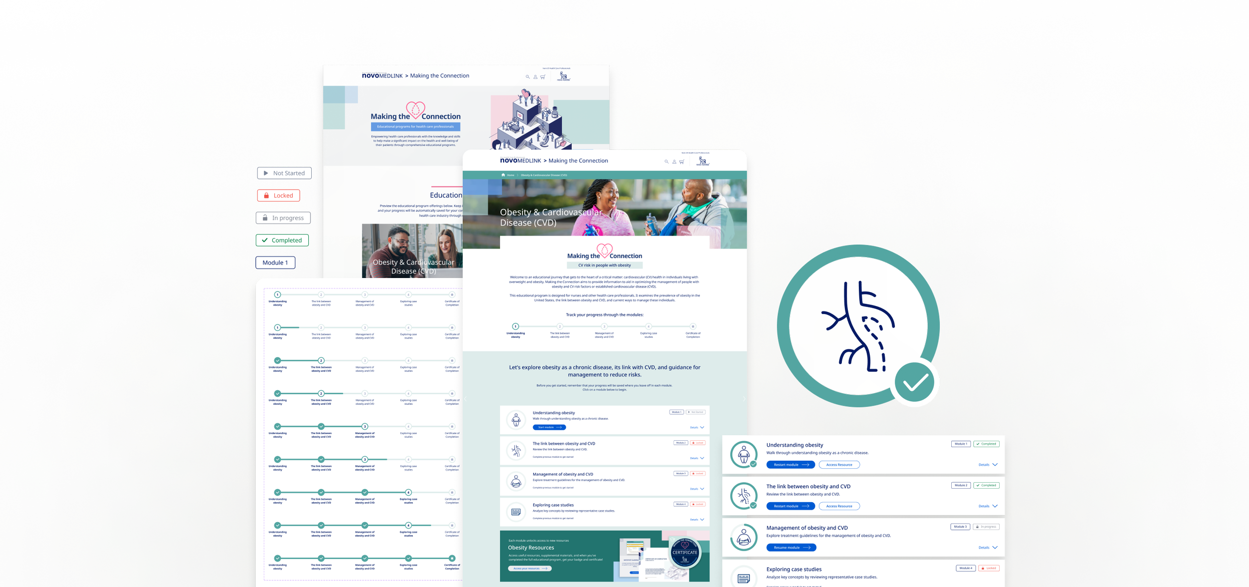
Track Progression and Resource Unlocking
As users completed modules, they gained access to additional resources. We integrated a visual badge unlockable, allowing users to earn certification badges that could be displayed on their professional profiles upon completion of a full track, adding a tangible incentive.
Navigation Overhaul
Improving Navigation within the modules
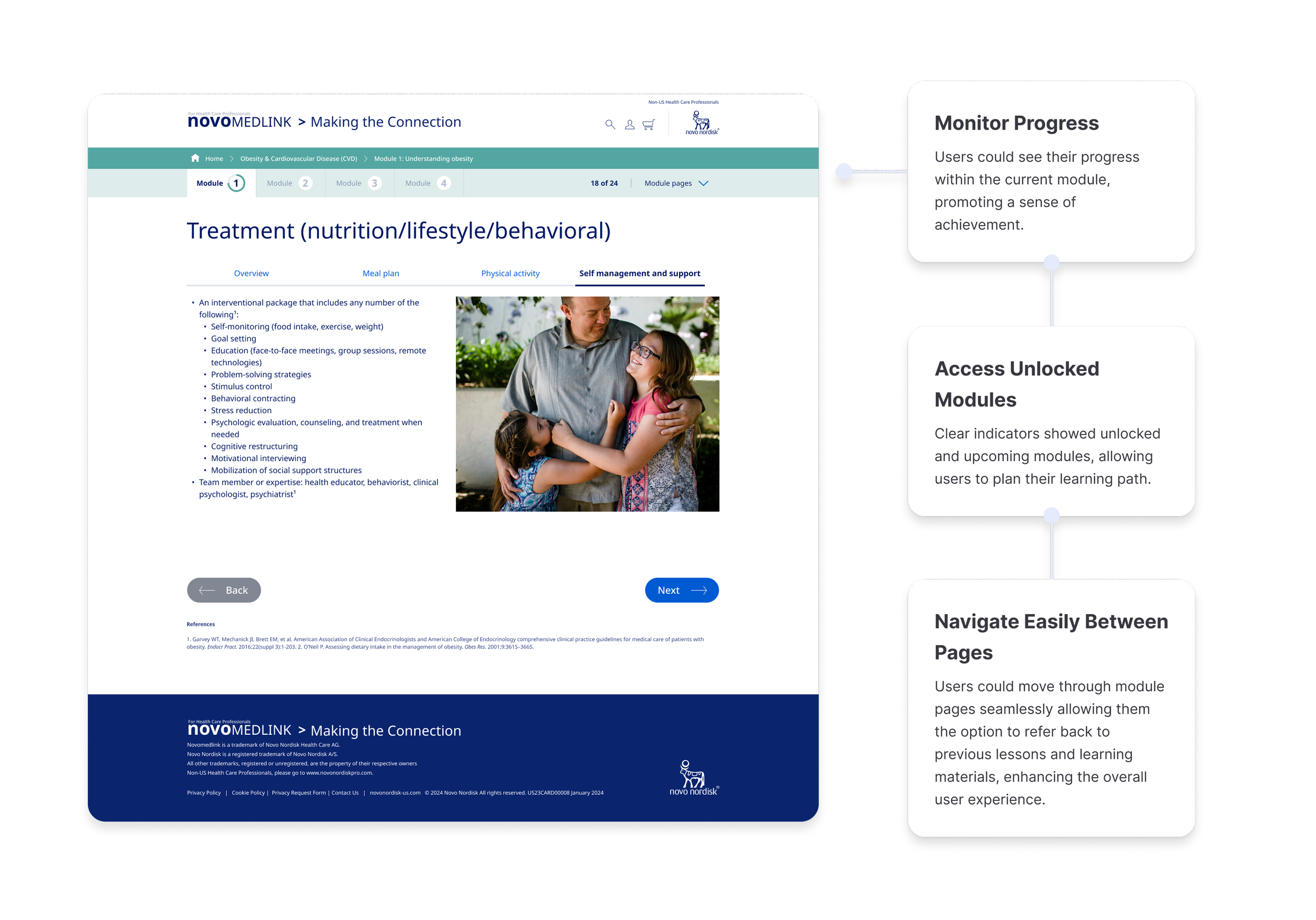
Previously, users were stuck clicking through slides, which didn’t encourage exploration. We introduced a new navigation bar that not only allowed for better progress tracking in the modules themselves but also made it easier to revisit sections through this multi-functional navigation bar which allows users to:
Introducing Interactive Quizzes to Boost Learning Outcomes
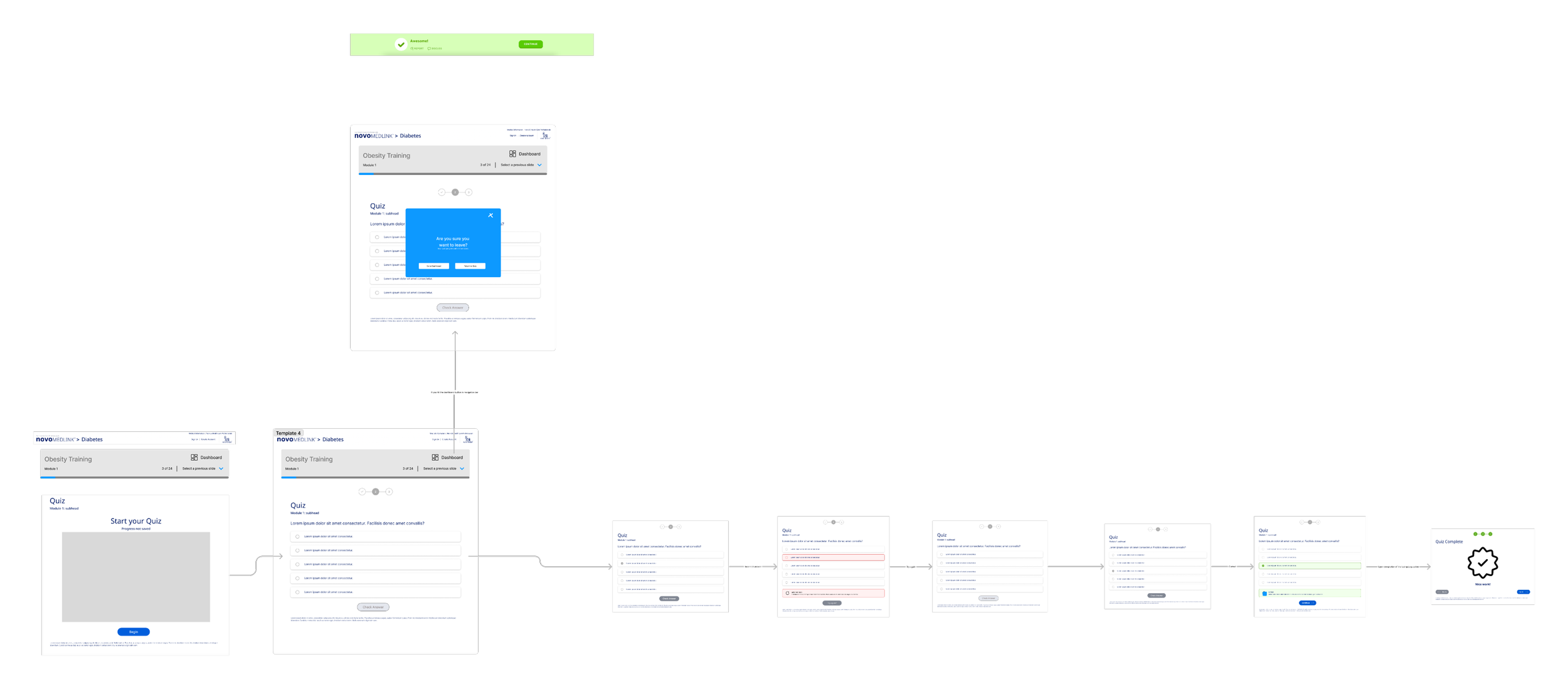
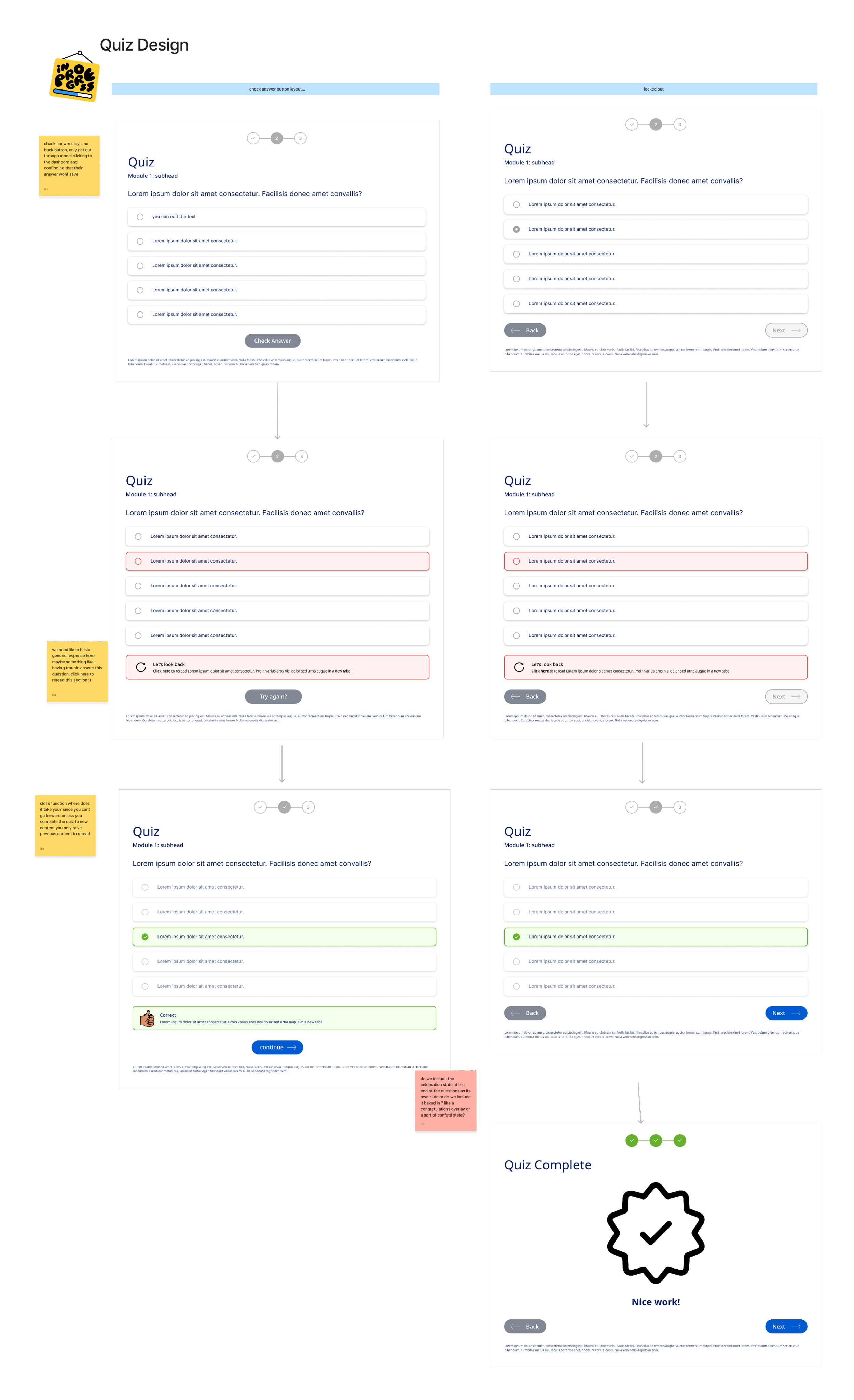
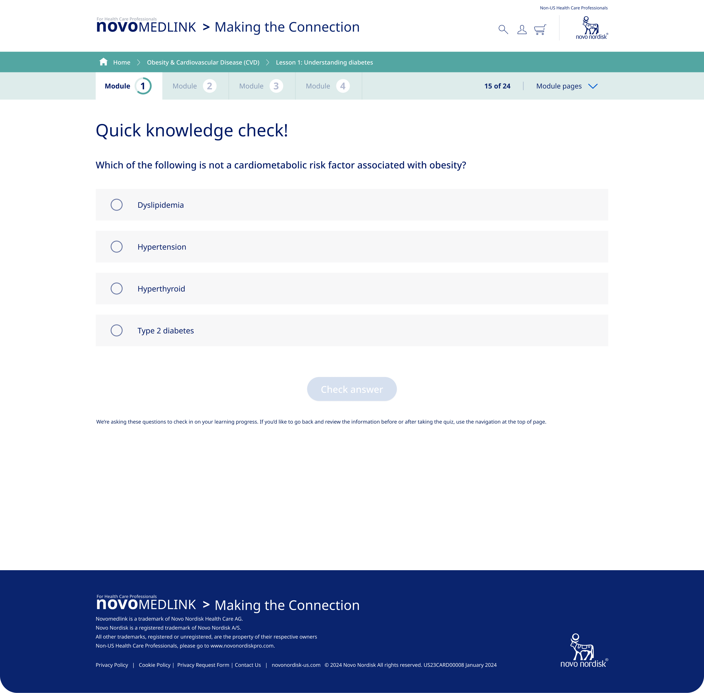
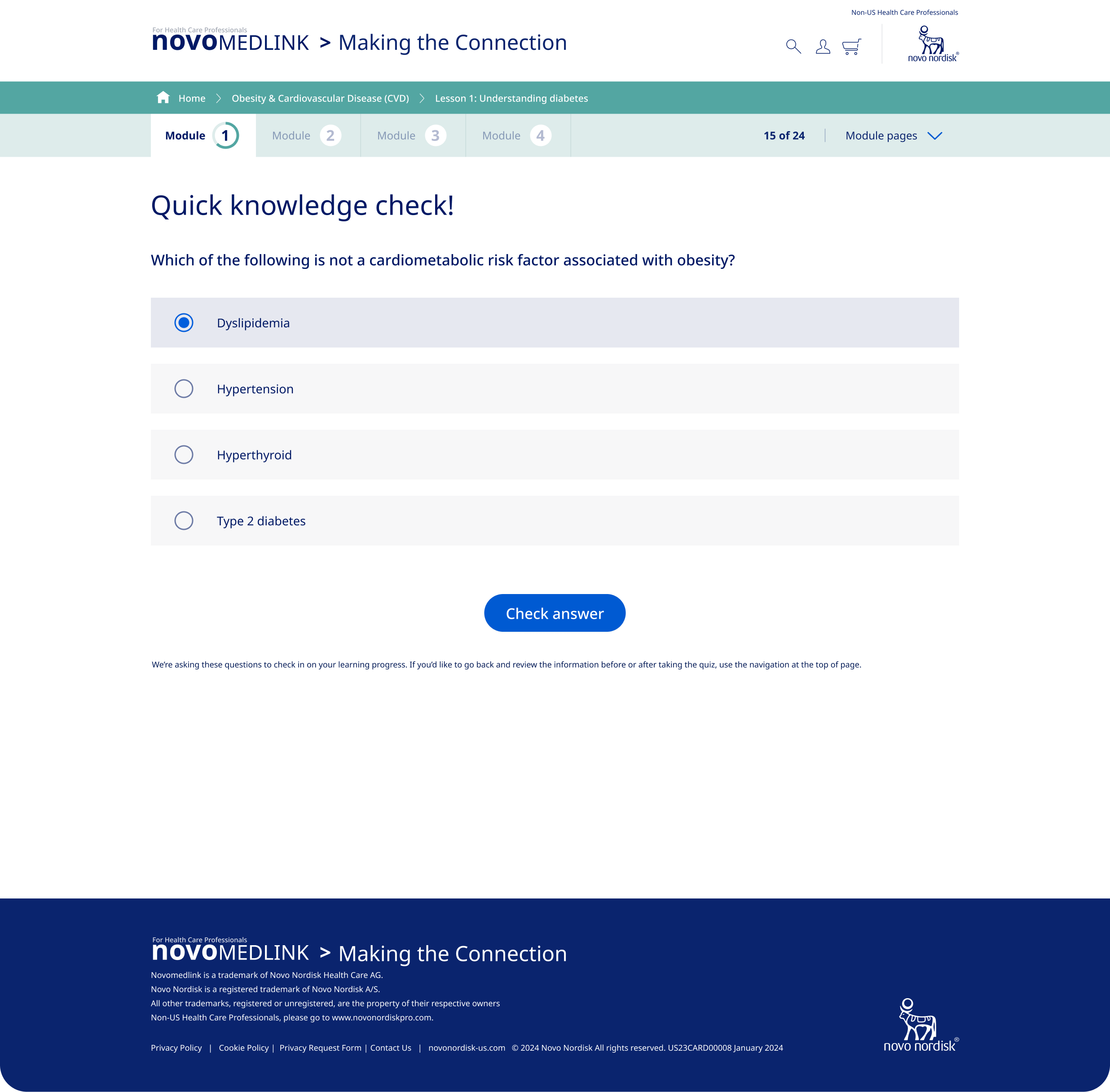
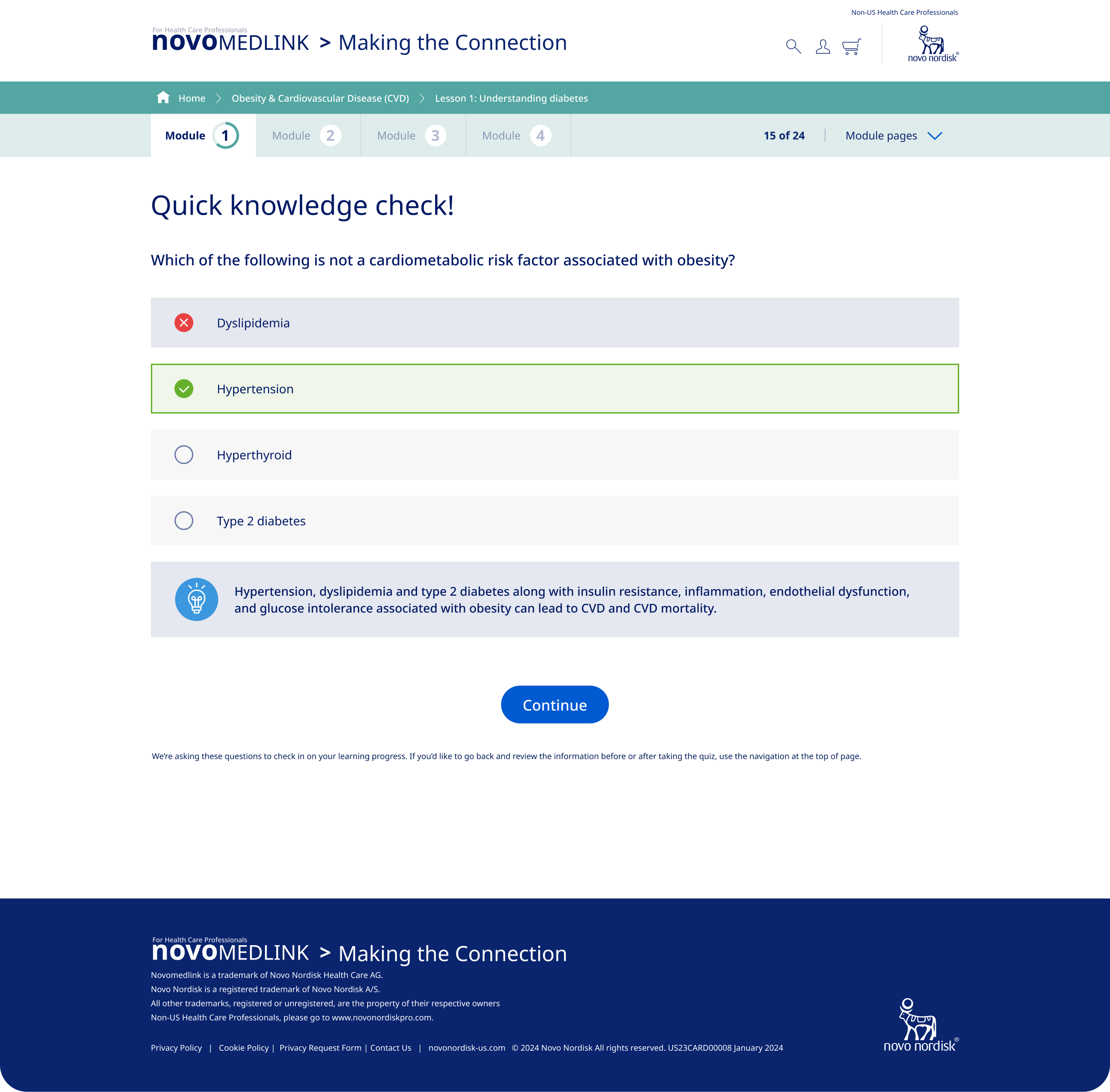
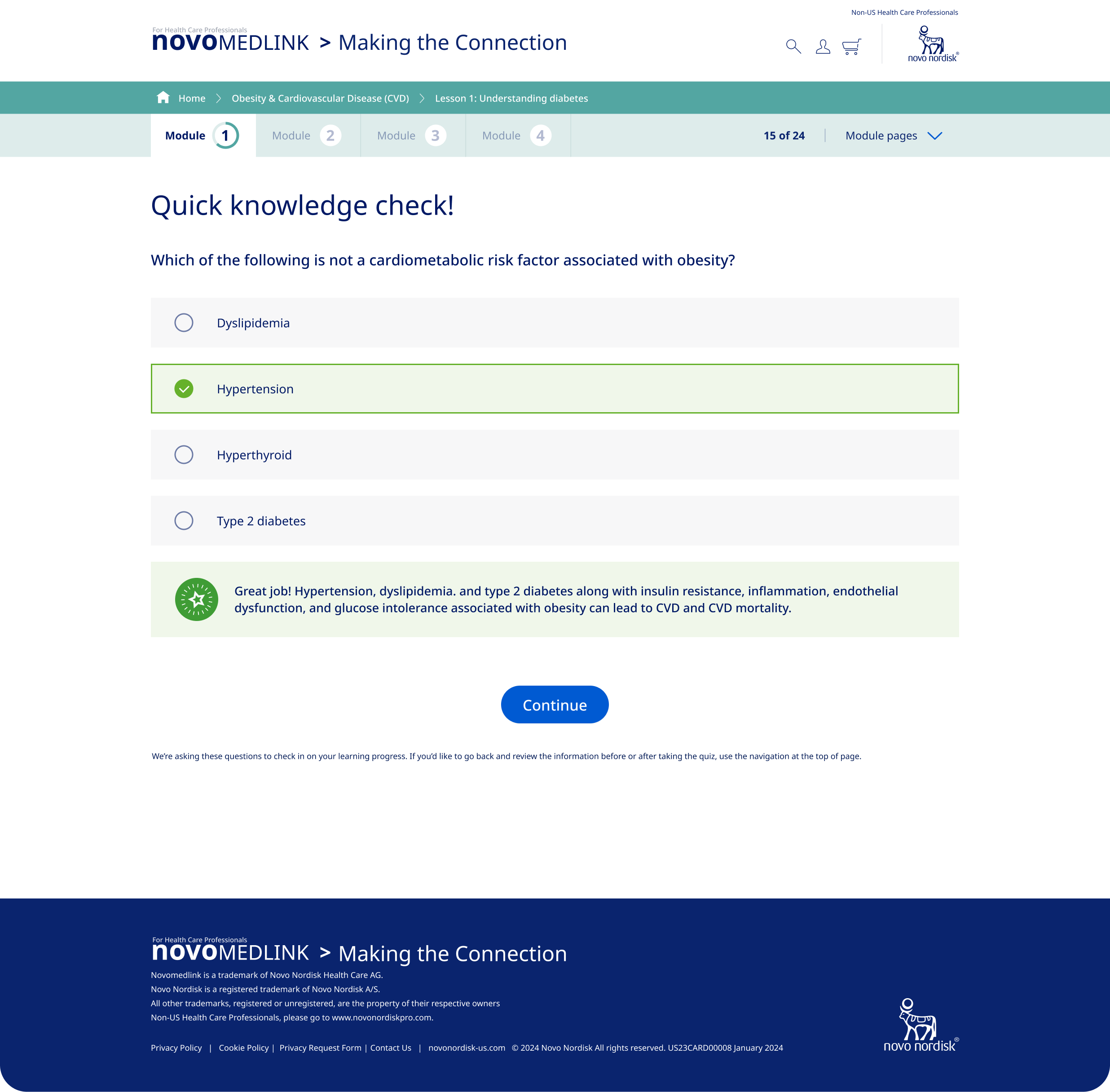
A key addition were interactive quizzes aimed at helping users retain critical information. Initially, we planned to include multiple quiz questions per module, inspired by platforms like Duolingo, to reinforce learning with immediate feedback and gamified elements.
However, due to scope changes and content limitations, we adapted the design to include a single knowledge check question per module. Despite this adjustment, we maintained correct and incorrect answer states to provide users with instant feedback, adding to engagement while staying in scope.
Working Within Constraints Without User Testing
Due to scope and budget limitations, we werent able to conduct real-time user testing during development, which was a step we would have loved to incorporate. Instead, we leaned on industry best practices, user expectations from similar educational platforms, and internal expertise to guide our design decisions. By focusing on known user needs, we aimed to create an experience that would resonate with healthcare professionals
Reflecting on the Process: Lessons Learned
This project showcases the importance of flexibility, especially when collaborating with another agency and designing without finalized content. Despite limitations, we successfully:
Developed Scalable Templates
Created adaptable templates that can accommodate future content, ensuring longevity and ease of updates.Enhanced Navigation and Engagement
Revamped site navigation and introduced interactive elements to make the learning experience more intuitive and engaging.Addressed Mobile Engagement Challenges
Prioritized mobile responsiveness to better serve the significant portion of users accessing the site via mobile devices.
Results & Looking Forward
Outcome
Boosted Engagement: The new navigation and interactive content helped improve user retention, especially on mobile devices.
Streamlined Usability: With a clear structure and easy-to-use features, users were able to navigate the site more efficiently and complete courses more frequently.
Next Steps
We plan to use A/B testing and post-launch analytics to refine the platform even further, using this data to drive ongoing improvements as the site evolves.